Green Yellow Comparison Graph - Insights through Data Visualization
RJ0900015_14
- Last Update 08/20/2025
- File Size 0.6MB
- # of Slides 2
- File Format PPTX
- Slide Ratio 16:9
- Color
Keywords
About the Product
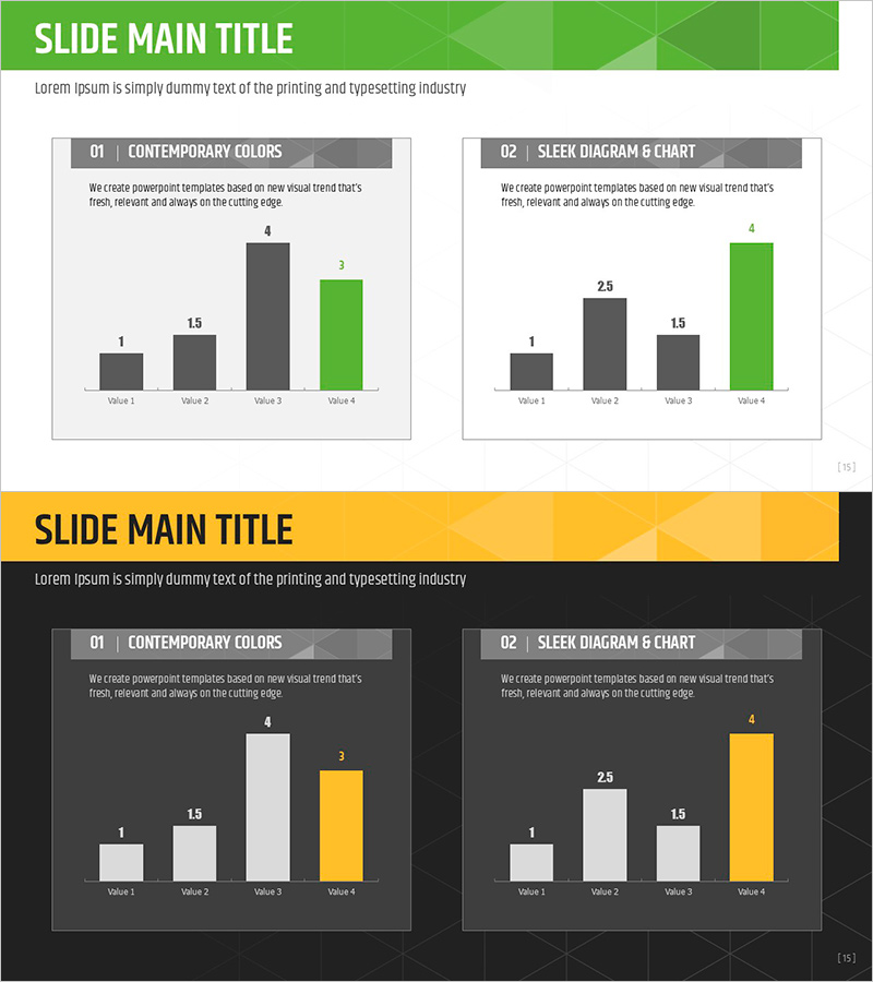
A 2-slide PowerPoint set optimized for data comparison and analysis. The first slide features a 4-item horizontal bar chart in green and charcoal tones, clearly displaying numerical comparisons across categories. The second slide applies the same structure with a yellow accent color for visual emphasis and alternative presentation options. Each slide presents four data points in a side-by-side bar layout, making value differences and rankings instantly recognizable. Delivered in 16:9 widescreen PPTX format compatible with modern presentation software, with fully editable colors and values for immediate use across diverse business presentations.
Usage Points
-
Main Usage
Quantitative data comparison and analysis using horizontal bar chart visualization. Four items displayed side-by-side enable instant recognition of value differences and performance rankings. Ideal for executive reports, quarterly performance reviews, departmental comparisons, and data-driven decision-making presentations.
-
How to Use
Slide 1 presents baseline data in green and charcoal tones; Slide 2 applies yellow accent to highlight specific items. Edit bar heights and numerical labels to input actual data, and adjust colors to match brand guidelines. Use both slides sequentially for narrative flow or display them together for direct comparison emphasis.
-
Recommended For
Finance and accounting teams for quarterly earnings reports, marketing teams for channel performance comparison, sales teams for regional or product sales analysis, HR departments for headcount distribution across divisions, and consulting firms for benchmarking data visualization. Suitable for any role requiring quantitative analysis and presentation.
-
Slide Structure
Slide 1: Title area + descriptive text + 4-item horizontal bar chart (green and charcoal tones) + legend. Slide 2: Identical layout with yellow accent applied. Each bar includes Value 1–4 labels with corresponding data points (1, 1.5, 4, 3). Clean 2-column layout in 16:9 aspect ratio with clear information hierarchy.
Related Products
-

Target Market Analysis Data Table - Market Growth Statistics
#Market and Competitor Analysis #Graph #Other
-

Compass Shape Circle Graph – Optimal Choice for Market and Competitor Analysis
#Market and Competitor Analysis #Graph #Market Analysis
-

Idea Development Analysis Chart – Data-Driven Innovation
#Product/Service Introduction #Business Introduction #Diagram
-

Businessman Cartoon Theme Circle Graph – Market Analysis and Competitiveness
#Product/Service Introduction #Market and Competitor Analysis #Graph
