Architectural Illustration Gauge Chart – Visualizing Technical Status
RJ0900013_5
- Last Update 08/19/2025
- File Size 0.3MB
- # of Slides 2
- File Format PPTX
- Slide Ratio 16:9
- Color
Keywords
- #Content-Based Slides
- #Design-Based Slides
- #Product/Service Introduction
- #Business Introduction
- #Graph
- #Other
- #Development Status
- #Technological Status
- #16:9
- #technical status gauge chart PowerPoint
- #gauge chart slide design
- #progress visualization PPT
- #how to make a gauge chart in PowerPoint
- #horizontal comparison chart slide
About the Product
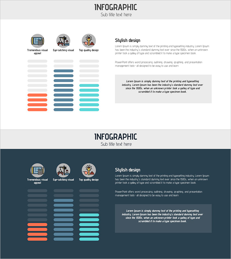
A PowerPoint slide that visualizes technical status, progress, and achievement rates using a horizontal gauge chart design. The layout features three icons at the top (visual representation, collaboration, quality), three horizontal gauge bars in the center (orange, navy, and cyan), and a descriptive text box on the right side. This slide effectively displays technical development progress, system implementation status, capability maturity, and other quantitative metrics in a clear, comparative format. The 16:9 PPTX template is fully editable and ready to use immediately for technical presentations, project status reports, and capability assessments.
Usage Points
-
Main Usage
This slide presents technical status, progress rates, and achievement metrics using an intuitive gauge chart format. The three-item horizontal layout enables quick comparison of current states, making it ideal for communicating technical development stages, system implementation progress, and capability maturity levels to stakeholders.
-
How to Use
Use this slide in technical status presentations, project progress reports, and capability assessment meetings. Adjust the gauge bar colors and lengths to match your data, replace icons and titles with relevant item names, and add detailed explanations in the right text box. This design effectively communicates technical progress to investors, executives, and team members with credibility and clarity.
-
Recommended For
Recommended for R&D teams, technical development departments, project managers, CTOs, and development directors who need to report technical status. Ideal for investment pitches, technology partnership presentations, internal technical review meetings, and capability evaluations where objective progress visualization is essential.
-
Slide Structure
The slide consists of a title area at the top, three icons (visual representation, collaboration, quality), three horizontal gauge bars in the center (orange, navy, cyan), and a descriptive text box on the right. Each gauge displays progress from 0-100%, with color differentiation for visual distinction. Four editable text areas (title, three item names, description) provide flexible customization options.
Related Products
-

Mobile App Service Development Status – Doughnut Chart Visualization
#Product/Service Introduction #Business Introduction #Graph
-

Infographic Slide for Performance Analysis – Clear Visualization
#Product/Service Introduction #Business Introduction #Graph
-

Technology Achievement Donut Chart
#Product/Service Introduction #Business Introduction #Graph
-

Comparative Analysis Graph of Work Progress Status – Visual Data Insights
#Product/Service Introduction #Business Introduction #Diagram
