Population Change Area Graph Visual
RJ0900013_27
- Last Update 08/19/2025
- File Size 0.3MB
- # of Slides 2
- File Format PPTX
- Slide Ratio 16:9
- Color
Keywords
About the Product
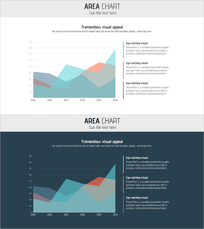
A PowerPoint slide visualizing population trends from 2020 to 2030 using a multi-layer stacked area chart. The cumulative area graph features three distinct layers in gray, coral, and teal, clearly showing data progression over time. A legend with three descriptive text fields on the right side explains each layer's meaning. Two background versions—light and dark—are included, allowing you to match your presentation's overall tone. Ideal for market analysis, demographic reports, and trend presentations requiring multi-data comparison across time periods. Ready to use immediately with editable text and chart elements.
Usage Points
-
Main Usage
Designed to compare and analyze multiple data layers over time—such as population shifts, market size trends, and customer segment changes. The stacked area format simultaneously displays total volume and individual item changes, making it highly effective for presenting decision-making evidence and strategic insights.
-
How to Use
Use in market analysis sections of business plans, pitch decks, and investor presentations to illustrate demographic data, market size evolution, and customer segmentation trends. Simply edit the legend text to match your actual data categories and update chart values for immediate deployment.
-
Recommended For
Marketing managers, business planners, data analysts, and executives preparing reports on population dynamics, market shifts, and customer composition changes. Particularly suited for government statistics presentations, market research reports, and new business initiative pitches requiring time-series trend analysis.
-
Slide Structure
Composed of a title area (top center), subtitle text (top left), a stacked area chart with 2020–2030 timeline on the X-axis (center left), and three layer-specific description text boxes (right side). All text fields and chart colors are fully editable, allowing customization to match your data and branding.
Related Products
-

Market Analysis Area Graph – Risk Reduction
#Market and Competitor Analysis #Graph #Other
-

Curve Graph Slide for Analyzing Regional Figures – Effective Data Delivery
#Market and Competitor Analysis #Graph #Other
-

Market Analysis Slide with Line Charts on TV
#Market and Competitor Analysis #Graph #Other
-

Segmentation Graphs and Analysis Charts – Optimized for Market and Competitor Analysis
#Operational Plan #Market and Competitor Analysis #Graph
