Male and Female Comparison Analysis Horizontal Bar Graph – Results and Insights
RJ0900013_25
- Last Update 08/19/2025
- File Size 0.3MB
- # of Slides 2
- File Format PPTX
- Slide Ratio 16:9
- Color
Keywords
- #Content-Based Slides
- #Design-Based Slides
- #Market and Competitor Analysis
- #Graph
- #Customer Analysis
- #Horizontal Bar
- #Double Horizontal Bar
- #16:9
- #dual horizontal bar chart PowerPoint
- #male female comparison slide
- #data comparison chart template
- #demographic analysis presentation
- #how to create comparison chart in PowerPoint
About the Product
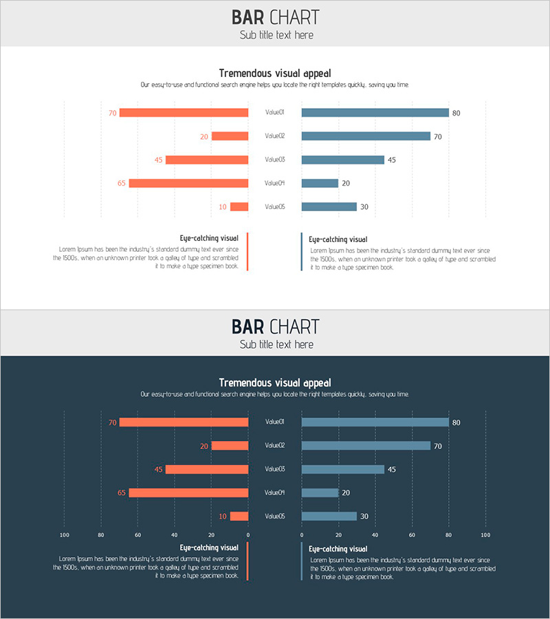
A dual horizontal bar chart PowerPoint slide that compares male and female data in a symmetrical left-right layout. The contrasting orange and blue color scheme makes the differences between the two groups immediately apparent, with five data items displayed side by side for easy comparison. Perfect for market analysis, customer segmentation, performance reviews, and demographic studies in business presentations. This 16:9 widescreen slide deck contains 2 slides with fully editable values, labels, and data points for quick customization.
Usage Points
-
Main Usage
This chart visualizes comparative data between two groups using a symmetrical bar structure. Ideal for gender comparisons, competitive analysis, time-period contrasts, and any scenario requiring side-by-side numerical evaluation. The bar lengths provide intuitive visual comparison while the balanced left-right layout creates professional, organized presentations.
-
How to Use
Apply this chart in market analysis sections for competitor performance comparison, customer analysis sections for demographic insights, and strategy sections for target-versus-actual performance reviews. Simply update the bar values and data labels to match your dataset, then customize the title and legend to fit your presentation context.
-
Recommended For
Marketing professionals, sales analysts, business intelligence specialists, market researchers, financial analysts, and executives preparing comparative reports. Suitable for any presentation requiring gender, age group, regional, or demographic comparisons.
-
Slide Structure
Two-slide deck featuring dual horizontal bar charts with 5 data items each. Orange bars (left) and blue bars (right) are symmetrically positioned around a center axis, with numerical labels clearly displayed. Each slide includes a descriptive text area at the bottom for adding analysis commentary or insights.
Related Products
-

Comparative Analysis Interactive Graph – Market Share Analysis
#Market and Competitor Analysis #Graph #Customer Analysis
-

Horizontal Bar Graph Analysis by Gender – Market Insights
#Market and Competitor Analysis #Graph #Customer Analysis
-

Competitor Comparison Paired Bar Graph – A Powerful Tool for Market Analysis
#Market and Competitor Analysis #Graph #Customer Analysis
-

Statistics on People's Physical Fitness in Bar Chart – Insights Aimed at Competitive Advantage
#Market and Competitor Analysis #Graph #Other
