Comparative Analysis Interactive Graph – Market Share Analysis
RJ0500016_7
- Last Update 06/11/2025
- File Size 1.1MB
- # of Slides 2
- File Format PPTX
- Slide Ratio 16:9
- Color
Keywords
- #Content-Based Slides
- #Design-Based Slides
- #Market and Competitor Analysis
- #Graph
- #Customer Analysis
- #Market Share
- #Horizontal Bar
- #Double Horizontal Bar
- #16:9
- #bidirectional bar chart PowerPoint
- #horizontal bar graph slide template
- #comparative analysis chart
- #market share visualization
- #customer comparison slide
About the Product
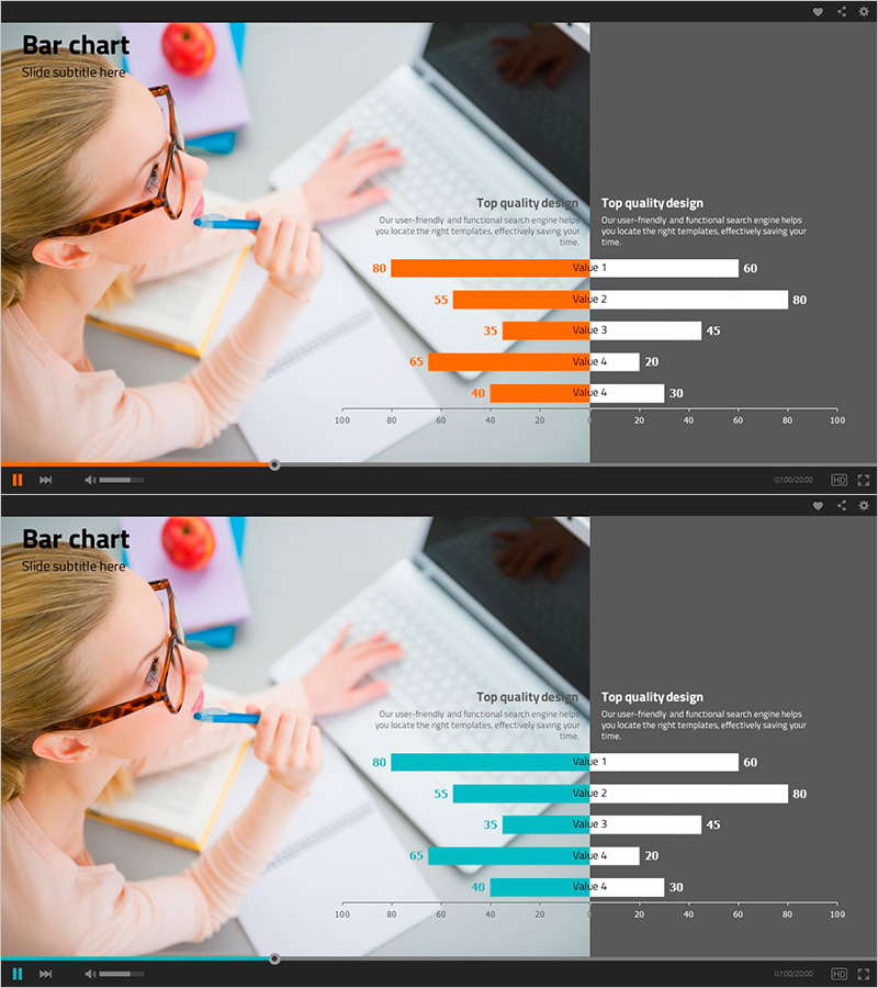
A horizontal bar chart PowerPoint slide optimized for market share analysis and comparative customer evaluation. The design uses contrasting orange and teal colors to clearly distinguish two data series, displaying five items in both left and right directions simultaneously. Each bar includes numeric labels for immediate value comparison during presentations, making it ideal for business performance analysis, competitive benchmarking, and customer satisfaction surveys. Provided as a 2-slide set in 16:9 widescreen format, ready for instant customization and deployment.
Usage Points
-
Main Usage
Visualizes two data series side-by-side in opposite directions to compare market share, competitor performance, or customer satisfaction metrics. Numeric labels enable precise value comparison, making it highly effective for presenting decision-making evidence and performance insights.
-
How to Use
Use in business presentations when comparing two groups or metrics. Ideal for market analysis sections showing competitor comparison, sales reports displaying regional or product performance, and customer survey result analysis to enhance audience comprehension.
-
Recommended For
Marketing managers, sales directors, executive report writers, market analysts, and consultants presenting competitive analysis, performance comparisons, and customer data insights.
-
Slide Structure
Two-slide set with the first slide emphasizing orange bars and the second highlighting teal bars. Each slide displays 5 items (Value 1–5) in bidirectional layout with a 0–100 numeric axis and corresponding labels on both sides.
Related Products
-

User Gender Ratio Analysis Graph – Effective Customer Insights
#Market and Competitor Analysis #Graph #Customer Analysis
-

Drug Addiction Gender Ratio Analysis Graph - Customer Analysis
#Market and Competitor Analysis #Graph #Other
-

Customer Analysis Double Bar Graph – Effective Market Analysis
#Market and Competitor Analysis #Graph #Customer Analysis
-

Gender Comparison Analysis Pairwise Bar Graph – Understanding Customers' First Step
#Market and Competitor Analysis #Customer Success Stories #Graph
