Construction Equipment Usage Graph
RJ0900013_14
- Last Update 08/19/2025
- File Size 0.3MB
- # of Slides 2
- File Format PPTX
- Slide Ratio 16:9
- Color
Keywords
About the Product
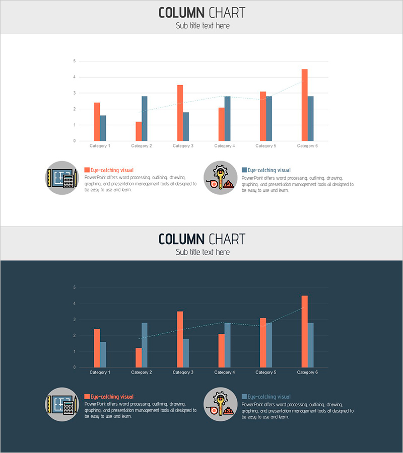
A grouped column chart PowerPoint slide designed to visualize construction equipment usage data across six categories with two data series. The chart displays orange and dark blue columns side-by-side for each category, enabling direct numerical comparison. Two design versions are included: one with a light background and one with a dark background. Each slide features icons and legend text at the bottom to clarify data meaning. This presentation template is ideal for construction, manufacturing, and market analysis reports where equipment usage, sales performance, and competitive positioning need clear visual representation.
Usage Points
-
Main Usage
Used in construction, manufacturing, and industrial sectors to compare two data series—such as equipment usage rates, sales figures, or market share—across six categories simultaneously. Essential for executive reports, business proposals, and market analysis presentations where data-driven decision-making is critical.
-
How to Use
Adjust the orange and dark blue column heights to match your data values for each category. Use the legend and icons to clarify what each series represents. Select either the light or dark background version based on your presentation environment and document style. Add additional insights or notes in the text area below the chart.
-
Recommended For
Construction companies, equipment rental firms, manufacturing executives, project managers, market analysts, and consultants. Recommended for quarterly performance reports, competitive analysis, investor pitch decks, and business plan presentations where data credibility is essential.
-
Slide Structure
Slide 1 (light background): Title area + 6-category grouped column chart with 2 series (orange and dark blue) + legend + 2 icons + descriptive text. Slide 2 (dark background): Identical structure on dark blue background with enhanced color contrast. Y-axis range 0–5, X-axis with 6 category labels on both slides.
Related Products
-

Chart of Change in Sales by Country – Market Analysis and Competitive Advantage
#Market and Competitor Analysis #Graph #Other
-

THE ROAD Presentation Table & Tied Vertical Bar Graph – Market and Competitor Analysis
#Market and Competitor Analysis #Diagram #Graph
-

Comparison of Group Results – Data Visualization
#Market and Competitor Analysis #Graph #Competitor Analysis
-

Competitiveness Table and Chart Analysis – Market and Competitor Analysis
#Market and Competitor Analysis #Diagram #Graph
