Line Chart to Visualize Real Estate Sales Trends – Market Analysis Strategy
RJ0900012_19
- Last Update 08/19/2025
- File Size 0.1MB
- # of Slides 2
- File Format PPTX
- Slide Ratio 16:9
- Color
Keywords
- #Content-Based Slides
- #Design-Based Slides
- #Marketing Plan and Strategy
- #Financial Plans and Performance
- #Graph
- #Pricing Strategy
- #Sales and Revenue
- #Line
- #Line Chart
- #16:9
- #line chart PowerPoint
- #multi-series graph slide
- #real estate trend analysis
- #market data visualization
- #how to create line chart in PowerPoint
About the Product
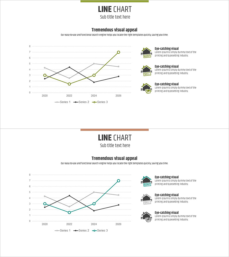
A multi-series line chart PowerPoint slide designed to visualize real estate sales trends and market dynamics from 2020 to 2026. This presentation template displays three data series simultaneously using distinct colored lines—green, black, and gray—enabling clear comparison and analysis of parallel trends. Point markers and gridlines ensure precise data reading and professional presentation. The slide is ready to use for market analysis reports, financial performance presentations, strategic planning sessions, and investment pitch decks in the real estate and finance sectors.
Usage Points
-
Main Usage
Ideal for comparing multiple data trends over time, such as real estate sales performance, price fluctuations, market share evolution, and competitive analysis. Enables stakeholders to identify patterns, forecast trends, and make data-driven decisions in financial and market analysis presentations.
-
How to Use
Double-click the embedded line chart to edit data values directly or replace with your own dataset. Customize axis labels, legend text, and chart title to match your presentation context. Adjust line colors, thickness, and marker styles to align with corporate branding guidelines.
-
Recommended For
Real estate agencies, construction companies, financial institutions, and investment firms presenting market analysis. Suitable for executive reports, investor presentations, strategic planning meetings, and marketing strategy sessions requiring multi-dimensional data comparison.
-
Slide Structure
Two-slide layout featuring a 3-series line chart as the focal point. X-axis displays years (2020–2026), Y-axis shows numerical values (0–8). Three data series are color-coded and labeled in the legend. Right side includes three text annotation areas for insights. Top section contains title and subtitle; bottom features a colored accent bar framing the design.
Related Products
-

An Analysis of the Low Sales Section of Coffee – Graph Visualizing Sales and Performance
#Financial Plans and Performance #Risk Management and Regulatory Compliance #Graph
-

Cost Increase Rate Analysis Chart
#Financial Plans and Performance #Diagram #Graph
-

Business Outlook Analysis Chart – Future Predictions and Planning
#Financial Plans and Performance #Diagram #Graph
-

Selling Cost Analysis Chart – Clearly Illustrating Financial Performance
#Financial Plans and Performance #Diagram #Graph
