An Analysis of the Low Sales Section of Coffee – Graph Visualizing Sales and Performance
RJ0600057_4
- Last Update 07/05/2025
- File Size 4.5MB
- # of Slides 2
- File Format PPTX
- Slide Ratio 16:9
- Color
Keywords
- #Content-Based Slides
- #Design-Based Slides
- #Financial Plans and Performance
- #Risk Management and Regulatory Compliance
- #Graph
- #Sales and Revenue
- # Risk Management Strategy
- #Line
- #Line Chart
- #16:9
- #line chart PowerPoint
- #sales trend analysis slide
- #time series data visualization
- #performance metrics PPT
- #line graph template download
- #business analytics PowerPoint slide
About the Product
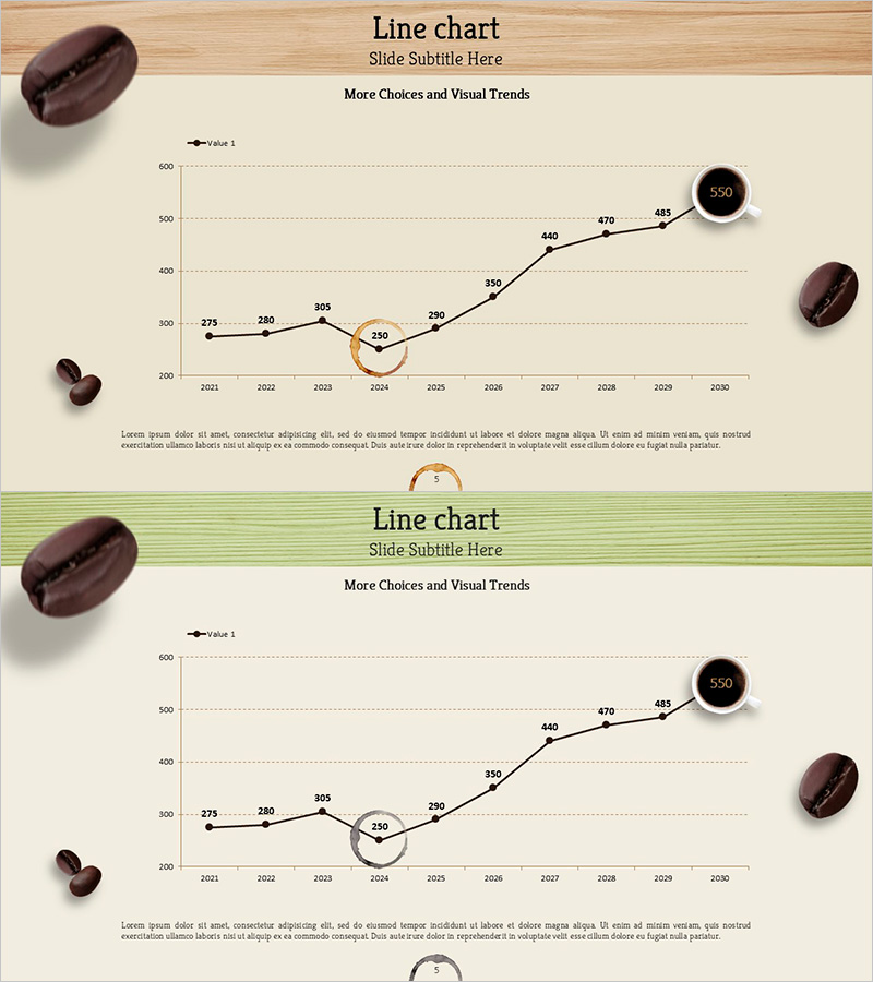
A PowerPoint slide featuring a line chart that visualizes 10 years of sales performance from 2021 to 2030 in the coffee industry. This presentation template effectively displays low sales periods and performance metrics through a single-series line graph with clear data point markers. The design uses a beige background with black line work and orange accent highlights to emphasize critical data points, while circular icons mark peak values. The 2-slide set is ready for immediate use in business reports, quarterly reviews, and strategic presentations.
Usage Points
-
Main Usage
Effectively visualizes changes in sales, performance indicators, and metrics over time. Optimized for analyzing low-sales periods in specific industries (coffee, retail, services) and emphasizing recovery trends in risk management and performance reporting.
-
How to Use
Use in business reports, quarterly performance presentations, investor briefings, and marketing analysis documents to explain sales fluctuations, customer satisfaction trends, and market share changes. Directly edit data values to input your actual figures for immediate customization.
-
Recommended For
Recommended for finance managers, marketing managers, business analysts, and executive presentations. Particularly suitable for meetings and board reports discussing low-growth period analysis, recovery strategy development, and performance improvement targets.
-
Slide Structure
2-slide set with each slide displaying a single line connecting 10 data points (2021–2030). Y-axis ranges from 0–600, X-axis shows years, key values (273, 280, 305, 250, 290, 330, 440, 470, 483, 550) are labeled at nodes, and the peak value (550) is highlighted with a circular accent icon.
Related Products
-

Graph Analysis by Year Sales
#Market and Competitor Analysis #Financial Plans and Performance #Graph
-

Visualizing Sales and Meeting Progress Over Time
#Market and Competitor Analysis #Financial Plans and Performance #Graph
-

Sales Response Strategies for High and Low Points Presentation Slide
#Operational Plan #Financial Plans and Performance #Graph
-

Changes in Forest Area – Market Analysis and Future Prospects
#Market and Competitor Analysis #Financial Plans and Performance #Graph
