Analysis Chart of the Architectural Sector in the Region
RJ0900010_18
- Last Update 08/18/2025
- File Size 0.9MB
- # of Slides 2
- File Format PPTX
- Slide Ratio 16:9
- Color
Keywords
- #Content-Based Slides
- #Design-Based Slides
- #Market and Competitor Analysis
- #Graph
- #Other
- #Market Analysis
- #Horizontal Bar
- #Segmented Horizontal Bar
- #Map
- #16:9
- #map PowerPoint slide
- #architectural sector analysis presentation
- #regional market analysis chart
- #horizontal bar graph slide
- #world map PowerPoint template
About the Product
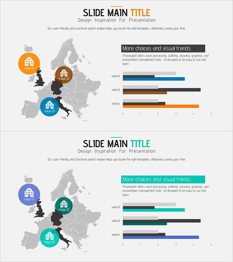
A PowerPoint slide that visualizes the architectural sector market status across European regions. The design features a grayscale Europe map with three circular markers in orange, blue, and brown tones positioned on key locations to represent regional architectural values. A horizontal bar chart on the right side displays comparative data for three metrics, reinforcing quantitative analysis. This slide composition is immediately applicable for regional market presentations in architecture, real estate, and urban development sectors. Formatted in 16:9 widescreen ratio, PPTX file type, with 2 slides for easy editing and customization.
Usage Points
-
Main Usage
This slide simultaneously presents regional market conditions and quantitative data for architecture, real estate, and urban development sectors. Circular markers on the map emphasize regional locations while the horizontal bar chart on the right provides numerical comparisons. It enhances credibility in presentations to investors, employees, and clients regarding regional market analysis.
-
How to Use
Replace the map marker colors and labels with your regional data, then update the horizontal bar chart values with actual market statistics. Drag markers to target regions and adjust the legend and title to match your presentation context. The two-slide format allows for comparative analysis or time-series trend visualization across different periods.
-
Recommended For
Recommended for architects, real estate developers, urban planning consultants, and construction company professionals presenting regional market analysis. Ideal for investor presentations, business proposals, market research reports, and regional development strategy presentations where map-based data visualization is essential.
-
Slide Structure
Both slides 1 and 2 share identical layout: left side features a grayscale Europe map with three circular markers (orange, brown, blue, each with labels) positioned on regions; right side displays three-row horizontal bar chart (value1, value2, value3, each with 2-3 data series). Marker colors correspond to chart series, creating clear visual linkage between regional locations and numerical values.
Related Products
-

Target Country Analysis Chart – Data Visualization for Market Analysis
#Market and Competitor Analysis #Graph #Other
-

Asia Target Market Analysis Graph – Tremendous Visual Appeal
#Market and Competitor Analysis #Graph #Other
-

Target Country Year-by-Year Analysis Chart – Data Visualization for Market Analysis
#Market and Competitor Analysis #Graph #Other
-

Target Market Analysis Data Table - Market Growth Statistics
#Market and Competitor Analysis #Graph #Other
