Stacked Bar Chart by Country – Visualizing Market Trends
RJ0900009_6
- Last Update 08/18/2025
- File Size 0.6MB
- # of Slides 2
- File Format PPTX
- Slide Ratio 16:9
- Color
Keywords
- #Content-Based Slides
- #Design-Based Slides
- #Market and Competitor Analysis
- #Graph
- #Other
- #Market Analysis
- #Industry Trends
- #Horizontal Bar
- #Segmented Horizontal Bar
- #Map
- #16:9
- #100% stacked bar chart PowerPoint
- #stacked bar graph template
- #country data visualization
- #market trend slide
- #ratio comparison chart PowerPoint
About the Product
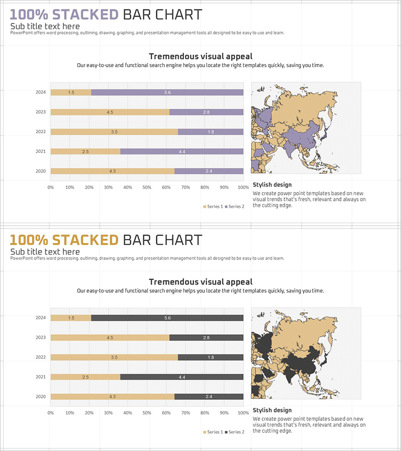
A 100% stacked bar chart PowerPoint slide visualizing 5-year country-level data across 2 data series. Two color versions are provided: beige and purple combination, and black and beige combination. Each slide includes a world map visualization to reinforce global market analysis context. Optimized for ratio-based data comparison and regional trend analysis, this slide deck is ready to use in marketing reports, sales presentations, and executive briefings.
Usage Points
-
Main Usage
This slide compares ratio-based data by year and country in cumulative stacked format. It divides 100% into 2 or more series to display both the composition ratio of each item and year-over-year trend changes simultaneously. Ideal for market share analysis, sales channel composition, regional revenue distribution, and other ratio-driven business metrics.
-
How to Use
Enter data values for each year row (2020–2024) and the bar chart updates automatically. Color coding distinguishes each series and can be customized from the color palette. The world map can be used to highlight analysis target countries or removed as needed. Select between the 2 color versions based on your presentation context and brand guidelines.
-
Recommended For
Marketing and sales reports, market analysis presentations, quarterly and annual performance reviews, regional sales analysis, global business strategy meetings, investor relations materials, consulting proposals, and any situation requiring persuasive ratio-based data visualization for executive or client audiences.
-
Slide Structure
2-slide layout. Each slide contains a title area, 100% stacked bar chart (5 years × 2 data series), legend, and world map visualization. The chart axis scales from 0 to 100%, with each series color-coded. Data labels appear within each segment for easy value reference and quick comprehension.
Related Products
-

100% Stacked Bar Chart Abstract Pattern Presentation
#Market and Competitor Analysis #Graph #Other
-

National Trend Change Graph Visualization – Horizontal Bar Chart
#Market and Competitor Analysis #Graph #Other
-

Market Trend Analysis with Horizontal Bar Stacked Chart – Detailed Data Presentation
#Market and Competitor Analysis #Graph #Market Analysis
-

Asia Target Market Analysis Graph – Tremendous Visual Appeal
#Market and Competitor Analysis #Graph #Other
