Market Trend Analysis with Horizontal Bar Stacked Chart – Detailed Data Presentation
RB0800047_7
- Last Update 03/26/2025
- File Size 0.2MB
- # of Slides 2
- File Format PPTX
- Slide Ratio 4:3
- Color
Keywords
- #Content-Based Slides
- #Design-Based Slides
- #Market and Competitor Analysis
- #Graph
- #Market Analysis
- #Industry Trends
- #Horizontal Bar
- #Segmented Horizontal Bar
- #4:3
- #horizontal stacked bar chart PowerPoint
- #stacked bar graph template
- #market analysis slide
- #data comparison chart
- #business analytics presentation
- #how to create stacked bar chart in PowerPoint
About the Product
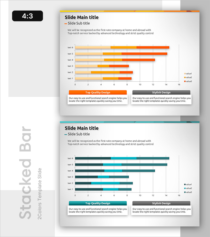
A horizontal stacked bar chart PowerPoint slide optimized for market trend analysis and multi-series data comparison. The chart features six items with three data series (value1, value2, value3) displayed in orange, red, and beige gradients, enabling clear visualization of market share, sales performance, and competitive positioning. Each bar segment represents a distinct data category, making it ideal for business reports, market analysis presentations, and financial comparisons. The 4:3 aspect ratio template includes two fully editable slides ready for immediate use in presentations.
Usage Points
-
Main Usage
Visualize multi-dimensional data by displaying six items with three overlapping data series in stacked format. This chart simultaneously shows individual segment values and total item magnitude, making it ideal for market share analysis, sales breakdown, and competitive benchmarking.
-
How to Use
Insert into business reports, marketing strategy presentations, or investor pitch decks within the market analysis or performance section. Double-click chart elements to edit values, modify colors to match corporate branding, and customize axis labels and legend text as needed.
-
Recommended For
Marketing managers, executives, business analysts, and consultants presenting market conditions, sales trends, customer segmentation, or competitive analysis. Particularly effective for strategy meetings, board presentations, and client pitches requiring quantitative data visualization.
-
Slide Structure
Slide 1: Orange gradient header with title + 6-item horizontal stacked bar chart (3 data series) + two descriptive text boxes at bottom. Slide 2: Teal gradient header with identical chart structure. Bars aligned on 0–16 axis scale with right-aligned legend showing value1, value2, value3 categories.
Related Products
-

Bar Chart Slide for Theme Park Market Trends
#Market and Competitor Analysis #Graph #Market Analysis
-

Plant Horizontal Bar Chart – Understand Market Trends
#Market and Competitor Analysis #Graph #Market Analysis
-

100% Stacked Bar Chart Abstract Pattern Presentation
#Market and Competitor Analysis #Graph #Other
-

Paint Piano and Segmentation Bar Graph – Market Trend Analysis
#Market and Competitor Analysis #Graph #Market Analysis
