Curve Graph of a Meal – Business Strategy
RJ0800051_10
- Last Update 08/14/2025
- File Size 0.3MB
- # of Slides 2
- File Format PPTX
- Slide Ratio 16:9
- Color
Keywords
- #Content-Based Slides
- #Design-Based Slides
- #Business Strategy
- #Market and Competitor Analysis
- #Graph
- #Achievements
- #Market Status
- #Line
- #Line Chart
- #16:9
- #line chart PowerPoint
- #multi-series chart template
- #trend analysis slide
- #performance comparison graph
- #business data visualization
- #line graph PPT download
About the Product
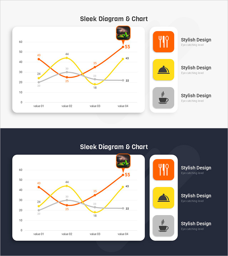
A multi-series line chart PowerPoint slide that visualizes business performance and market trends across three data series. The orange, yellow, and gray lines intersect at four data points (value 01 through value 04), clearly showing trend changes and comparative performance. Each data point displays numerical labels for precise value comparison, while the right-side icon panel (utensil, hat, beverage) emphasizes category meanings. Presented in 16:9 widescreen format with 2 slides, offering both light and dark background versions. This presentation template is ready for immediate use in business reports, strategy documents, and performance analysis presentations.
Usage Points
-
Main Usage
Displays changes in business performance metrics, market trends, sales volume comparisons, and customer satisfaction trends over time across multiple indicators simultaneously. The intersection points and rising/falling segments of three series are instantly recognizable, making it effective for strategy development and evidence-based decision-making presentations.
-
How to Use
Apply this slide in quarterly or annual performance reports, business strategy meetings, investor presentations, and market analysis briefings. Customize the series colors and labels to match your data, then use immediately in your presentation without additional design work.
-
Recommended For
Business strategists, marketing teams, financial analysts, project managers, and executives presenting performance metrics and competitive indicators. Ideal for quarterly earnings presentations, annual business planning sessions, and market analysis reports.
-
Slide Structure
Comprises 2 slides, each displaying 3 data series (orange, yellow, gray) across 4 data points (value 01–04). Features a Y-axis scale from 0 to 60, X-axis with 4 categories, and a right-side icon legend panel. Both light and dark background design versions are included for flexible presentation contexts.
Related Products
-

Sewing Graph Chart – Market Status and Performance Analysis
#Business Strategy #Market and Competitor Analysis #Diagram
-

Infographic Slide Visualizing App Market Sales Trends
#Business Strategy #Market and Competitor Analysis #Graph
-

Market Analysis Broken Line Graph – Visualizing Business Performance
#Business Strategy #Market and Competitor Analysis #Graph
-

Market Status Chart Analysis – Data-Driven Insights
#Business Strategy #Market and Competitor Analysis #Graph
