Facility Personnel Survey Graph – Infographic Design
RJ0900007_7
- Last Update 08/17/2025
- File Size 0.1MB
- # of Slides 2
- File Format PPTX
- Slide Ratio 16:9
- Color
Keywords
- #Content-Based Slides
- #Design-Based Slides
- #Business Management
- #Market and Competitor Analysis
- #Graph
- #Other
- #Project Organization and Roles and Responsibilities
- #Customer Analysis
- #Circles
- #Doughnut Chart
- #16:9
- #donut chart PowerPoint slide
- #pie chart data visualization
- #ratio infographic template
- #personnel survey chart
- #how to create donut chart in PowerPoint
About the Product
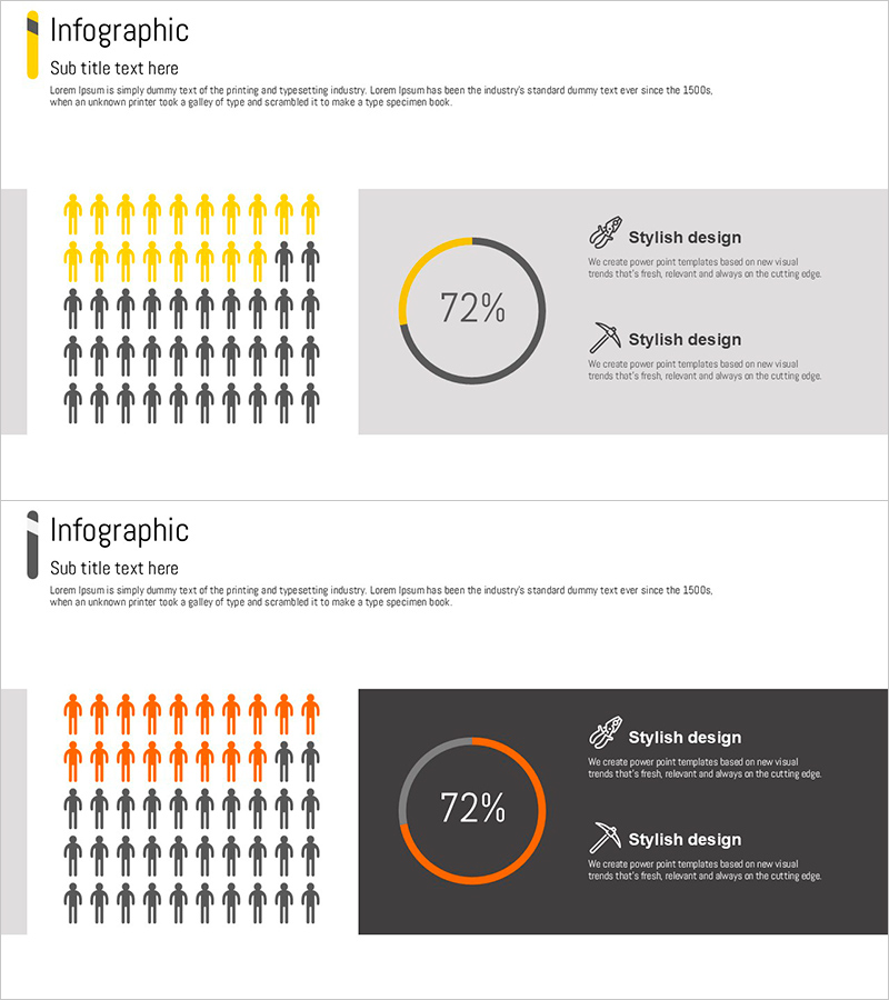
A donut chart PowerPoint slide template for visualizing facility personnel survey data with professional infographic design. The two-color scheme of gray and orange emphasizes the 72% ratio, while silhouette icons on the left and the donut chart on the right are arranged side-by-side to enhance information delivery. Two slide layouts are provided: white background and dark gray background versions, allowing you to match your presentation's tone and style. This ready-to-use slide template is perfect for business management reports, personnel status presentations, and organizational analysis discussions.
Usage Points
-
Main Usage
Clearly display departmental personnel ratios, facility manager distribution, and job-level workforce composition using a donut chart format. The 72% emphasis visually highlights key metrics, increasing the persuasiveness of reports and presentation materials.
-
How to Use
Enter department names or job titles in the left silhouette icon area, then replace the donut chart numbers with your actual data. Use the white background version for bright-toned presentations and the dark gray version for sophisticated business reports.
-
Recommended For
Ideal for HR team organizational analysis, business management personnel allocation reports, executive organizational structure briefings, and regular business review meetings. Particularly effective for HR presentations and management reports requiring ratio emphasis.
-
Slide Structure
Two-slide layout with Slide 1 featuring white background with gray and orange donut chart, and Slide 2 with dark gray background and orange-emphasized donut chart. Each slide includes left-side personnel silhouette icons (approximately 20 human figures) and right-side donut chart (72% ratio display) with two text input areas.
Related Products
-

User Analysis Donut Chart – Optimal for Market and Competitor Analysis
#Market and Competitor Analysis #Graph #Other
-

Customer Share Analysis Chart – Insights for Successful Business
#Market and Competitor Analysis #Graph #Other
-

Customer Analysis Donut Chart - Visualizing Market Share
#Market and Competitor Analysis #Graph #Other
-

Internet of Things User Analysis Status – Customer Insights and Data Visualization
#Product/Service Introduction #Market and Competitor Analysis #Graph
