Target Market and Percentage Bar - Visual Diagram for Market Analysis
RJ0900007_6
- Last Update 08/17/2025
- File Size 1.7MB
- # of Slides 2
- File Format PPTX
- Slide Ratio 16:9
- Color
Keywords
About the Product
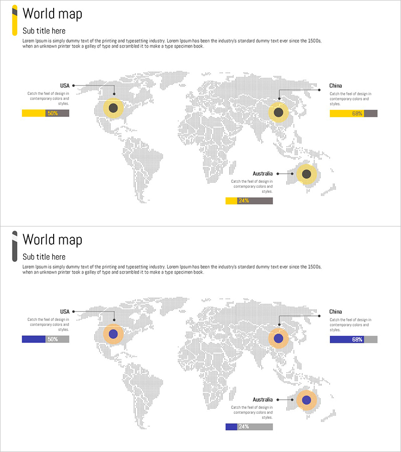
A world map-based PowerPoint slide designed for global market analysis and regional comparison. This presentation template features three key markets—USA, China, and Australia—highlighted with yellow and blue circular charts, each accompanied by percentage bars showing market share at a glance. The gray-toned world map background provides a professional backdrop for clear data visualization, making it ideal for international business presentations, market entry strategies, and investor pitch decks. The 2-slide set includes both yellow and blue color versions, with fully editable text and numerical fields for customization.
Usage Points
-
Main Usage
This slide visually represents global market analysis and regional comparisons using a world map with circular charts and percentage bars. It supports strategic decision-making for international business expansion by clearly communicating market share data across key regions.
-
How to Use
Use this slide in market entry strategy presentations, global sales reports, regional revenue comparisons, and investor relations pitches. Simply replace the region names, descriptions, and percentage values with your own data. Choose between the yellow or blue color version to match your corporate branding.
-
Recommended For
International business managers, marketing strategy teams, investor relations professionals, and executives preparing global expansion reports. Especially effective for presenting market share analysis, new market entry plans, and global growth strategies to stakeholders.
-
Slide Structure
The slide features a world map background with three regional zones (USA, China, Australia), each containing a circular chart, descriptive text field, and percentage bar. Total of 6 editable data fields per slide plus title and subtitle areas. Both slides share identical layouts with different color schemes.
Related Products
-

Target Market Year-to-Year Comparison Analysis – Visualizing Market Trends
#Market and Competitor Analysis #Graph #Other
-

Target Country Analysis Chart – Data Visualization for Market Analysis
#Market and Competitor Analysis #Graph #Other
-

Global Target Market Analysis Graph
#Market and Competitor Analysis #Diagram #Graph
-

Gauge Charts by Region – Market Analysis and Competitiveness
#Market and Competitor Analysis #Graph #Other
