Survey Graph of Residential Environment
RJ0900006_25
- Last Update 08/17/2025
- File Size 0.1MB
- # of Slides 2
- File Format PPTX
- Slide Ratio 16:9
- Color
Keywords
About the Product
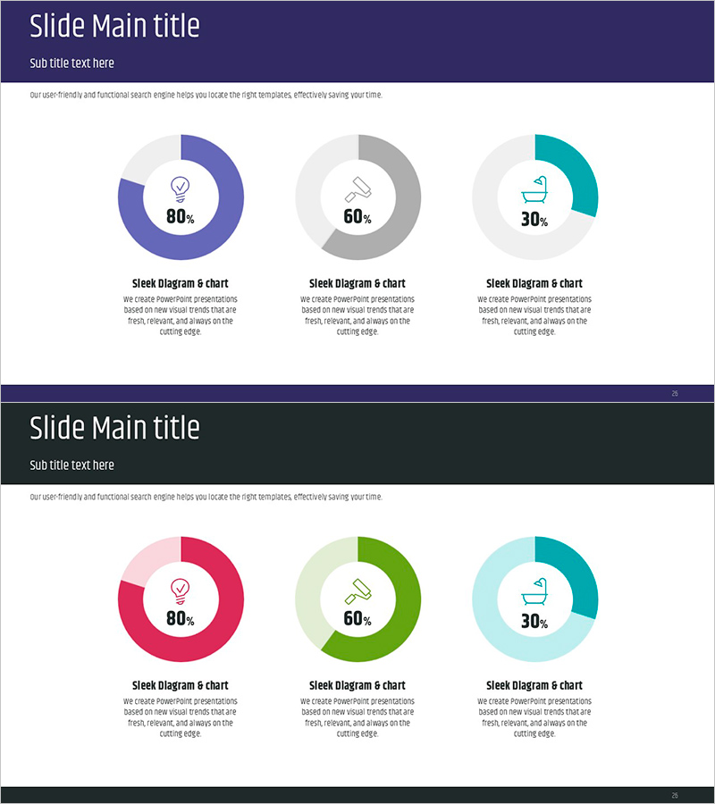
A donut-shaped pie chart PowerPoint slide designed to visualize residential environment survey data with clarity and impact. The slide features three data segments displayed in navy blue, gray, and teal color schemes, with percentage values and icons positioned at the center of each donut ring. The hollow center area allows for emphasizing key metrics or titles, making it ideal for presenting survey results, satisfaction ratings, and environmental assessments. Each chart includes descriptive labels and text areas below for context, enabling quick customization for various analytical presentations.
Usage Points
-
Main Usage
Visualize residential environment survey results and ratio-based data in an intuitive, audience-friendly format. The donut chart design emphasizes each segment's proportion while the hollow center draws focus to key statistics or titles, making complex data immediately comprehensible.
-
How to Use
Insert this slide into survey presentations, environmental assessments, or satisfaction analysis decks. Replace the sample percentages with actual data, adjust colors to match your organization's branding, and customize icons and labels to reflect your specific survey categories. The two-slide layout provides color variation options.
-
Recommended For
Urban planners, real estate marketing teams, construction companies, government policy analysts, environmental consultants, survey research firms, and residential development organizations presenting data-driven findings to stakeholders.
-
Slide Structure
Two-slide template featuring donut pie charts in horizontal layout. Slide 1 displays three donut charts in navy, gray, and teal (80%, 60%, 30% ratios). Slide 2 repeats the same structure with pink, green, and teal color variants. Each chart includes a center icon, percentage label, and descriptive text area below for flexible customization.
Related Products
-

Visualizing Project Progress and Future Prospects – Journey to Success
#Business Strategy #Market and Competitor Analysis #Graph
-

Customer Analysis People Icon Graph – Insights and Data Visualization
#Market and Competitor Analysis #Graph #Customer Analysis
-

Doughnut Chart Visualizing Service Market Share
#Market and Competitor Analysis #Graph #Market Share
-

Doughnut Chart for Product and Service Share Analysis
#Market and Competitor Analysis #Graph #Market Share
