Mint Orange Free Pie Chart – Data Visualization
RJ0900003_14
- Last Update 08/16/2025
- File Size 0.1MB
- # of Slides 2
- File Format PPTX
- Slide Ratio 16:9
- Color
Keywords
About the Product
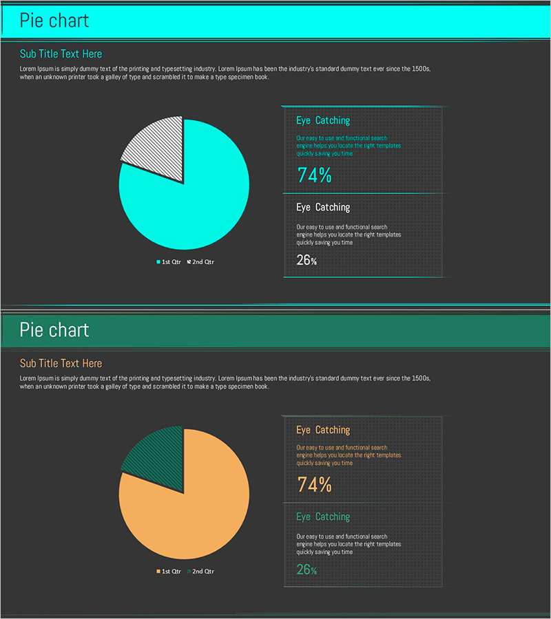
A 2-slide pie chart PowerPoint template featuring a mint cyan and orange two-tone color scheme for intuitive data ratio visualization. The first slide presents a basic 2-segment pie chart with legend, while the second slide adds percentage explanation boxes on the right side to enhance ratio interpretation. Dark gray background creates strong visual contrast with bright accent colors, optimizing for modern 16:9 widescreen presentations. Instantly applicable to marketing analysis, market share reports, budget allocation, and any presentation requiring composition ratio visualization. Fully editable chart segments, labels, and data values for flexible customization across various business contexts.
Usage Points
-
Main Usage
Visualize data composition ratios and the relationship between parts and whole at a glance. Ideal for displaying market share, budget distribution, customer composition, and sales proportions where each segment represents a percentage of the total. The mint-orange color contrast clearly emphasizes the difference between two key items.
-
How to Use
Use the first slide as an overview with the basic pie chart structure for introductory explanation. Apply the second slide with percentage boxes for detailed analysis sections. Freely edit colors, labels, and numerical values to adapt the template to different datasets. Segment sizes automatically adjust when you modify the data.
-
Recommended For
Marketing teams presenting market analysis, finance teams reporting budget status, sales teams analyzing customer composition, and executive presentations summarizing business performance. Particularly effective when comparing two major items where ratio clarity is essential for stakeholder communication.
-
Slide Structure
Slide 1: Title area + 2-segment pie chart (mint 74%, orange 26%) + legend. Slide 2: Title area + identical pie chart + two explanation boxes on right side with percentage and interpretation text fields. 16:9 widescreen format with dark gray background and bright color contrast.
Related Products
-

Sugar Usage Analysis Area Graph – Revenue Projections and Market Analysis
#Business Strategy #Market and Competitor Analysis #Graph
-

Competitive Advantage 3D Bi-directional Bar Graph – Essential Tool for Market Analysis
#Market and Competitor Analysis #Graph #Competitor Analysis
-

Market Demand Analysis PowerPoint Slide – Donut Chart Layout
#Market and Competitor Analysis #Graph #Customer Analysis
-

3D Printer Analysis Bar Graph
#Market and Competitor Analysis #Diagram #Graph
