Navy Yellow Pie Charts and Analysis - Effective Data Visualization
RJ0900001_8
- Last Update 08/15/2025
- File Size 0.2MB
- # of Slides 2
- File Format PPTX
- Slide Ratio 16:9
- Color
Keywords
- #Content-Based Slides
- #Design-Based Slides
- #Company Introduction
- #Business Introduction
- #Graph
- #Text Box
- #Key Achievements
- #Technological Status
- #Circles
- #Pie Chart
- #Sticky Note
- #16:9
- #pie chart PowerPoint slide
- #4-segment pie chart template
- #data visualization presentation
- #business analysis slides
- #pie graph PPT download
About the Product
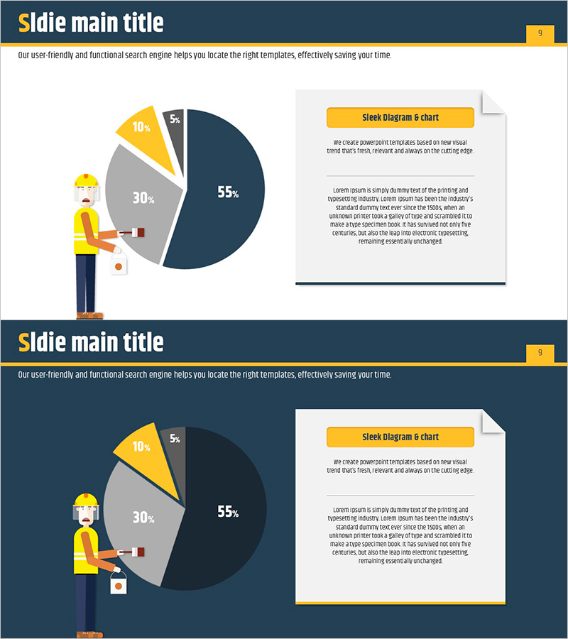
A professional pie chart PowerPoint slide that visualizes business data with four segments in navy and yellow color scheme. The high-contrast design ensures clarity on projector screens during presentations. Each segment displays percentage values and labels for intuitive ratio comparison. The 2-slide deck features an illustration of a character on the left and an information box on the right, making it suitable for company introductions, technology status reports, key achievements, and business analysis presentations. Provided in 16:9 widescreen PPTX format with fully editable elements.
Usage Points
-
Main Usage
This pie chart slide enables audiences to quickly grasp the proportional composition of business data. The four-segment breakdown is ideal for company introductions, technology status updates, key performance metrics, and market analysis sections where data credibility is essential.
-
How to Use
Input your actual data values into the pie chart on the left side, and the proportions will automatically adjust. Add analysis content and interpretation in the information box on the right to enhance audience comprehension. The navy and yellow color scheme can be retained or customized to match your company brand colors.
-
Recommended For
Finance professionals, marketing planners, business analysts, and executives responsible for data-driven presentations. Ideal for quarterly performance reviews, customer composition analysis, product sales reports, and market share presentations.
-
Slide Structure
Both slides feature identical layouts with a 4-segment pie chart on the left (showing example data: 55%, 30%, 10%, 5%), a character illustration in the center, and an information box with title and descriptive text area on the right side.
Related Products
-

Circular Graph for Big Data Analysis – Data Visualization
#Business Introduction #Technical Approach #Graph
-

Geometric Pattern Wide PPT Donut Chart – Business Introduction
#Company Introduction #Business Introduction #Graph
-

Stylish Design Visual – Effective Presentation Material
#Product/Service Introduction #Business Introduction #Graph
-

Analysis of Climbing Types Slide
#Company Introduction #Market and Competitor Analysis #Diagram
