Circular Graph for Big Data Analysis – Data Visualization
RJ0400053_24
- Last Update 06/01/2025
- File Size 0.2MB
- # of Slides 2
- File Format PPTX
- Slide Ratio 16:9
- Color
Keywords
- #Content-Based Slides
- #Design-Based Slides
- #Business Introduction
- #Technical Approach
- #Graph
- #Technological Status
- #Service Components
- #Circles
- #Pie Chart
- #16:9
- #pie chart PowerPoint slide
- #circular graph presentation template
- #data visualization PowerPoint
- #3-segment pie chart
- #ratio chart download
About the Product
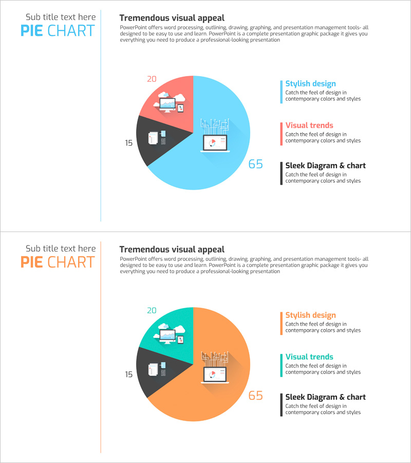
A professional pie chart PowerPoint slide designed for big data analysis and service composition visualization. This presentation template features a three-segment circular graph in sky blue, coral, and charcoal colors, enabling intuitive data ratio representation. Each section includes icons and numerical values to clearly express technology status, market composition, and service distribution. The slide deck contains 2 layouts optimized for 16:9 widescreen format. Fully editable PPTX format allows immediate customization for your presentation needs.
Usage Points
-
Main Usage
Visualize three key data categories—big data analysis, service composition, and technology status—using a proportional pie chart. The numerical values and icons in each segment enable audiences to instantly grasp relative data sizes and importance, making complex statistics clear and compelling.
-
How to Use
Apply this slide to sections requiring data ratio emphasis, such as technology overview, market analysis, or service distribution explanation. Easily edit segment text and values to match your data, and customize colors to align with your brand identity.
-
Recommended For
Data analysts, IT professionals, business strategists, and marketing managers presenting statistical information. Ideal for technology presentations, business reports, investor pitch decks, marketing plans, and corporate strategy documents.
-
Slide Structure
Two-slide layout featuring a three-segment pie chart with sky blue (65%), coral (20%), and charcoal (15%) color distribution. Legend and descriptive text area positioned on the right side. Each segment includes icons and numerical labels. Optimized for 16:9 widescreen format for modern presentation environments.
Related Products
-

Current Status of Energy Business Development – Pie Chart for Business Intro
#Product/Service Introduction #Business Introduction #Graph
-

Renewable Energy Icons and Hexagonal Pie Charts
#Business Introduction #Diagram #Graph
-

Analysis of Key Internet of Things Services – Technology Current Status and Structure
#Business Introduction #Technical Approach #Diagram
-

Green Yellow Data Analysis Chart – Market and Competitive Analysis
#Business Introduction #Market and Competitor Analysis #Diagram
