Blue Line Chart – Clear Visualization for Data Analysis
RJ0800052_25
- Last Update 08/15/2025
- File Size 0.6MB
- # of Slides 2
- File Format PPTX
- Slide Ratio 16:9
- Color
Keywords
About the Product
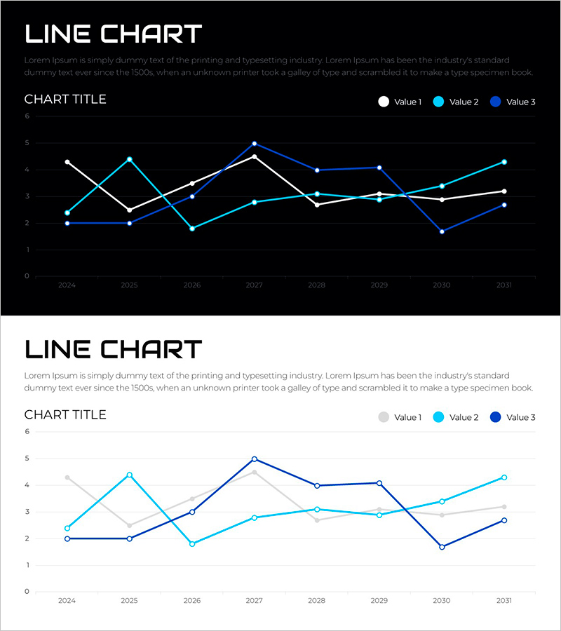
A multi-series line chart PowerPoint slide designed to compare three data streams across eight time periods from 2024 to 2031. The three data series are distinguished by white, light blue, and dark blue lines, creating clear visual separation on both dark and light backgrounds. This presentation slide effectively highlights numerical trends and patterns, making it ideal for business reports, financial analysis, market performance reviews, and executive briefings where comparative trend analysis is essential.
Usage Points
-
Main Usage
Visualize and compare multiple performance indicators over time on a single slide. Ideal for displaying sales trends, customer growth, market share evolution, or any metric requiring multi-line comparison to reveal correlations and patterns.
-
How to Use
Use in executive presentations, quarterly earnings reports, market analysis sessions, and financial performance briefings. Easily customize line colors and data points to match your actual figures. Both dark and light background versions are included for flexible presentation environments.
-
Recommended For
Finance teams, marketing managers, executives, data analysts, consultants, and project managers who need to communicate numerical trends. Suitable for investor presentations, board meetings, internal strategy sessions, and performance review meetings.
-
Slide Structure
Two-slide set. First slide features a dark background with white, light blue, and dark blue lines representing three data series across eight time points. Second slide uses a light background with the same data in gray, light blue, and dark blue for adaptability to different presentation settings.
Related Products
-

Service Analysis Line Graph – Visualization of Competitive Advantage
#Market and Competitor Analysis #Diagram #Graph
-

Business Idea Development Analysis Circle Graph
#Business Introduction #Market and Competitor Analysis #Diagram
-

Global Country Analysis Vertical Bar Graph – Market and Competitor Analysis
#Company Introduction #Market and Competitor Analysis #Graph
-

Idea Development Analysis Chart – Data-Driven Innovation
#Product/Service Introduction #Business Introduction #Diagram
