Update on Consumption Status – Business Insights through Graphs
RJ0800051_23
- Last Update 08/14/2025
- File Size 1.4MB
- # of Slides 2
- File Format PPTX
- Slide Ratio 16:9
- Color
Keywords
- #Content-Based Slides
- #Design-Based Slides
- #Business Strategy
- #Market and Competitor Analysis
- #Graph
- #Achievements
- #Competitive Advantage
- #16:9
- #food consumption trend line chart
- #market analysis PowerPoint slide
- #multi-series data visualization
- #competitive analysis PPT
- #consumption pattern presentation
About the Product
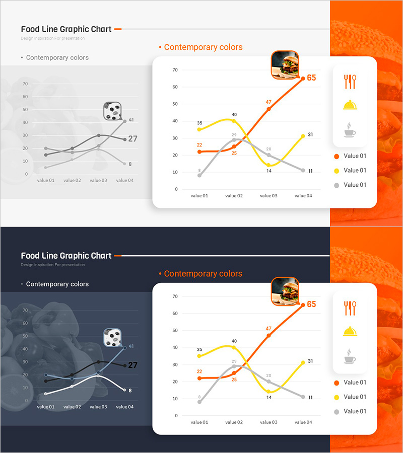
A PowerPoint slide featuring a multi-series line chart designed to visualize food industry consumption trends and market analysis. The slide uses orange, yellow, and gray line series to compare data across four time periods, making it ideal for competitive analysis, market trend assessment, and business strategy presentations. The layout includes a supporting chart on the left and a legend with food-related icons on the right, creating clear information hierarchy. Formatted in 16:9 widescreen for optimal projection display. Fully editable PPTX template ready for immediate data input and presentation delivery.
Usage Points
-
Main Usage
Visualizes food industry consumption patterns, market trends, and competitive performance through a multi-series line chart. Enables comparison of four data points across three value streams, providing clear visual evidence for strategic decision-making in market analysis sections.
-
How to Use
Deploy in business strategy, market analysis, and competitive analysis sections to illustrate consumption trend evolution. The two-chart approach—supporting chart on the left for detail emphasis and main graph in the center for overall trend comparison—guides audience understanding through progressive disclosure.
-
Recommended For
Ideal for marketing plans, business proposals, investor pitch decks, and market research reports. Recommended for food and beverage industry professionals, marketing teams, and executives presenting data-driven insights to stakeholders.
-
Slide Structure
Two-slide set with layout featuring left-side line chart (four data points) paired with right-side icon legend (food, beverage, and utensil icons). Second slide emphasizes the main central graph (three-series lines with four labeled values) alongside the legend for multi-data comparison.
Related Products
-

Blue Orange Growing Bar Graph – Performance and Competitive Edge
#Business Strategy #Market and Competitor Analysis #Graph
-

Bar Chart Analysis of Gardening Activities Trend – Performance and Competitive Advantage
#Business Strategy #Market and Competitor Analysis #Diagram
-

Functional Cosmetics Market Size Graph – Growth and Opportunities
#Business Strategy #Market and Competitor Analysis #Graph
-

Progress Donut Chart for Each Library Service
#Business Strategy #Market and Competitor Analysis #Graph
