Construction Facilities Status Donut Chart – Visualizing Business Strategies
RJ0300012_10
- Last Update 04/21/2025
- File Size 1.1MB
- # of Slides 2
- File Format PPTX
- Slide Ratio 16:9
- Color
Keywords
- #Content-Based Slides
- #Design-Based Slides
- #Business Strategy
- #Market and Competitor Analysis
- #Graph
- #Achievements
- #Competitive Advantage
- #Circles
- #Doughnut Chart
- #16:9
- #donut chart PowerPoint
- #pie chart slide template
- #3-segment ratio visualization
- #business status presentation
- #donut graph download
About the Product
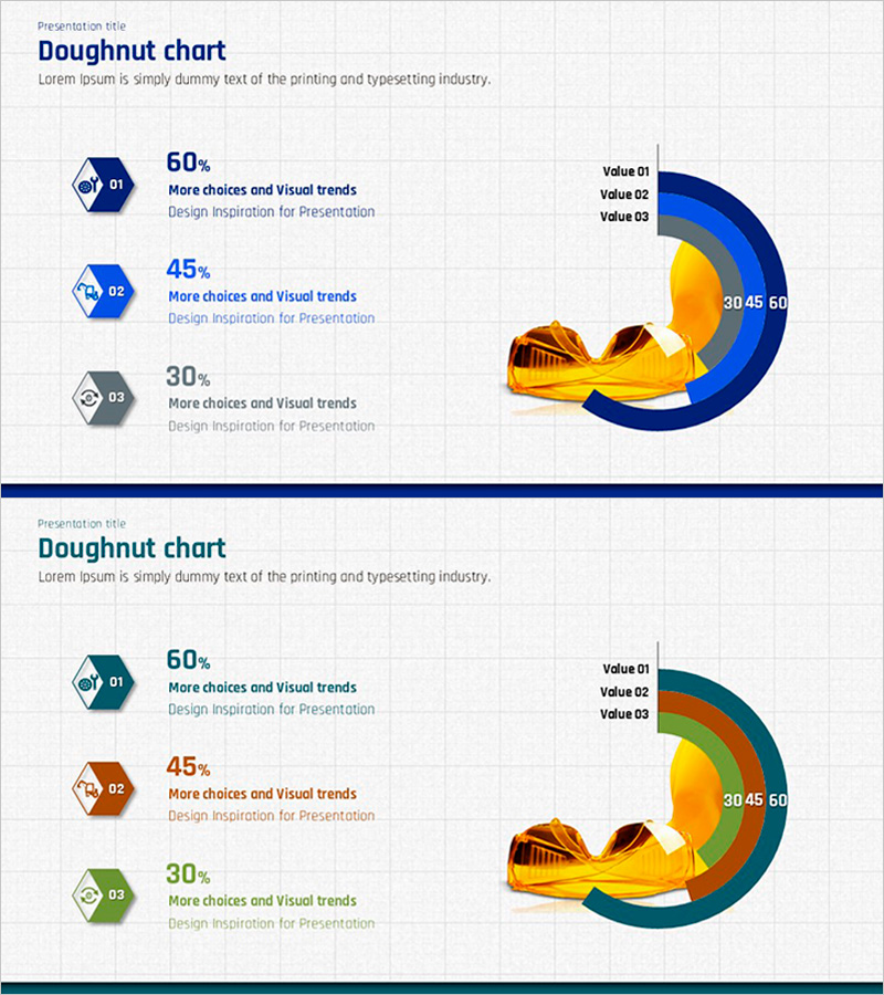
A PowerPoint slide that visualizes business strategies and facility status using a 3-segment donut chart with dual-color gradient effect. The left side features three hexagonal badges (01, 02, 03) displaying percentage values, while the right side shows a donut-shaped graph with Value 01, 02, 03 labels. Dark blue, orange, and yellow color gradients combined with a central gold illustration element enhance visual emphasis. The 2-slide set includes color variations (blue series and multi-color series) optimized for 16:9 widescreen format. This PowerPoint slide is ready to use for presentations on construction facilities, business progress, performance metrics, competitive advantages, and market analysis.
Usage Points
-
Main Usage
Optimized for visualizing the ratio and composition of three items such as business strategy, facility status, performance analysis, competitive advantage, and market analysis using a donut chart. Conveys the percentage values and relative weight of each segment intuitively, with a central illustration element emphasizing the presentation topic.
-
How to Use
Enter item names and percentages in the left hexagonal badges, then modify the Value labels on the right donut chart to match your actual data. Utilize the 2-slide color variations to select a design matching your presentation theme. The central illustration can be replaced or removed as needed.
-
Recommended For
Recommended for business planning and strategy presentations, facility and asset status reports, performance and results analysis, market share and competitive analysis, investment pitch decks, executive briefings, and consulting proposals where quantitative ratio data needs emphasis.
-
Slide Structure
Slide 1: Dark blue series donut chart (3-segment, 60%, 45%, 30% sample data) with three left-side hexagonal badges (01, 02, 03), right-side donut graph, and central gold illustration. Slide 2: Multi-color series (dark blue, orange, green) donut chart with identical structure. Both slides feature 16:9 widescreen ratio, grid background, and title area at top.
Related Products
-

Yoga's Advantage Donut Chart – Path to Wellness
#Business Strategy #Market and Competitor Analysis #Graph
-

Smart Healthcare Donut Chart – Market and Competition Analysis
#Business Strategy #Market and Competitor Analysis #Graph
-

Visualizing Business Performance with Tube Donut Chart – Strategies for Competitive Advantage
#Business Strategy #Market and Competitor Analysis #Graph
-

Progress Donut Chart for Each Library Service
#Business Strategy #Market and Competitor Analysis #Graph
