Cluster Slide Visualizing Preference for Water Activities
RJ0600092_18
- Last Update 07/15/2025
- File Size 0.8MB
- # of Slides 2
- File Format PPTX
- Slide Ratio 16:9
- Color
Keywords
- #Content-Based Slides
- #Design-Based Slides
- #Business Strategy
- #Market and Competitor Analysis
- #Diagram
- #Graph
- #Achievements
- #Competitive Advantage
- #Cluster
- #Horizontal Bar
- #Inclusive Cluster Diagram
- #Segmented Horizontal Bar
- #16:9
- #cluster diagram PowerPoint
- #water activities market analysis slide
- #4-node relationship diagram
- #preference analysis PPT template
- #data visualization PowerPoint
About the Product
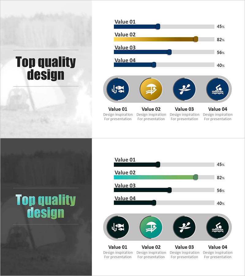
A cluster diagram PowerPoint slide designed for water activities market analysis. The slide features a central hub with four nodes radiating outward, each representing different water activity categories with preference data visualization. The design uses navy, gold, and white color palette with circular icons (fish, sailboat, paddle, swimmer) to distinguish each category clearly. The 2-slide set includes a title slide and a data visualization slide, ready for immediate use in presentations. Delivered in 16:9 widescreen PPTX format compatible with all presentation environments.
Usage Points
-
Main Usage
Visualizes water activities market preferences, characteristics, and competitive advantages through a central hub radiating to four directional nodes. Icon and color differentiation across nodes enables instant comprehension of category relationships and market share. Ideal for market analysis, business performance, and competitive positioning sections in strategic presentations.
-
How to Use
Start with the title slide to establish your analysis theme, then edit text and numerical data in each node on the data visualization slide. Circular icons are replaceable by category, and connecting lines and colors can be adjusted to reflect emphasis priority. Adding animations enables step-by-step explanation aligned with presentation flow.
-
Recommended For
Recommended for marketing and strategy team market analysis presentations, tourism and leisure industry business plans, new business proposals, and investor pitch decks' competitive advantage sections. Ideal for tourism boards, travel agencies, sports marketing professionals, business development managers, and consultants explaining customer preferences and market segmentation.
-
Slide Structure
Slide 1: Title slide with 'Top quality design' text. Slide 2: Central hub with four nodes radiating in cardinal directions (up, down, left, right). Each node contains a circular icon (fish, sailboat, paddle, swimmer symbols), Value 01-04 labels, and percentage data (45%, 82%, 56%, 40%). Navy, gold, and white color scheme represents data hierarchy.
Related Products
-

Donut Chart of Usage Ratio – Competitive Advantage Analysis
#Business Strategy #Market and Competitor Analysis #Diagram
-

Curved Theme Purple Bar Chart – Effective Performance Analysis
#Company Introduction #Business Strategy #Graph
-

Graph of Changes in Real Estate Sales Due to Changes in Interest Rates
#Business Strategy #Market and Competitor Analysis #Graph
-

Modern Blue Bar Chart for Performance Visualization – Business Strategy
#Business Strategy #Graph #Achievements
