Comparison of Sales Status by Product – Effective Data Visualization
RJ0800045_18
- Last Update 08/13/2025
- File Size 0.3MB
- # of Slides 2
- File Format PPTX
- Slide Ratio 16:9
- Color
Keywords
About the Product
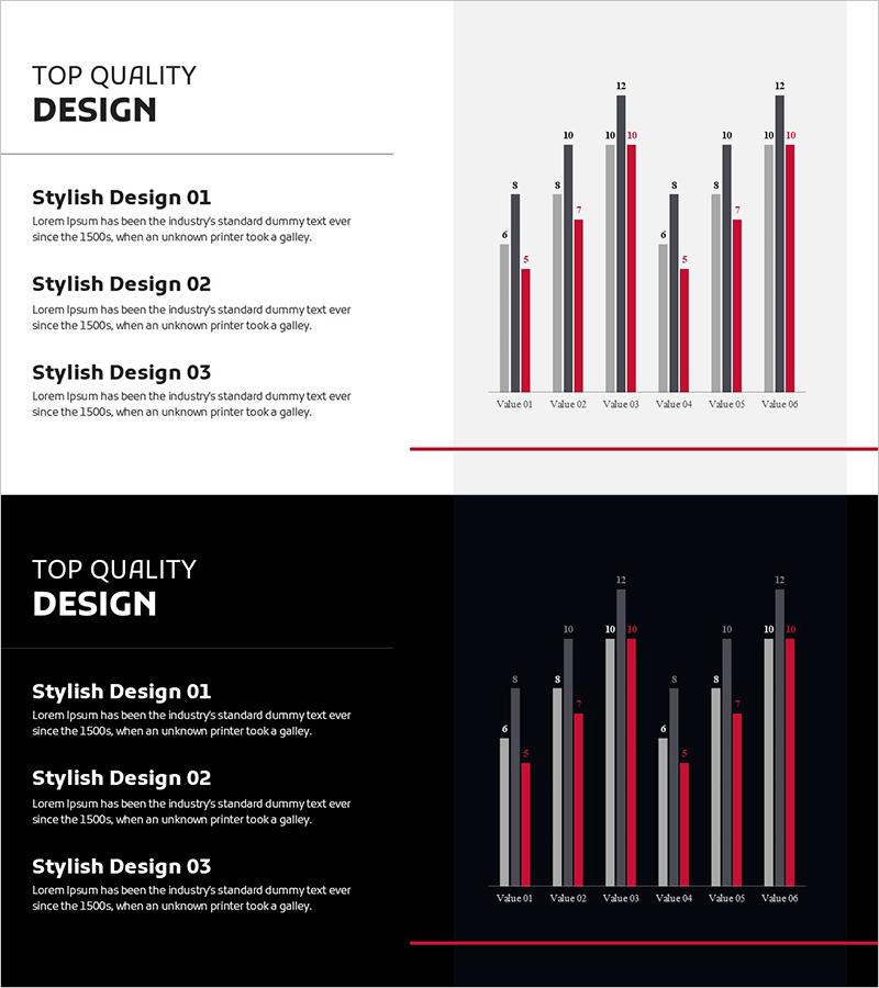
A vertical bar chart PowerPoint slide designed to clearly compare sales performance across product lines. This presentation template displays six products using three data series (gray, dark gray, and red), with numerical labels (6–12) positioned above each bar for enhanced readability. Two design variations are included: a light background version and a dark background version, allowing you to match your presentation environment. The 2-slide set is fully editable and ready to use in business reports, quarterly presentations, sales analysis, and executive briefings.
Usage Points
-
Main Usage
This slide enables visual comparison of quantitative data such as sales revenue, transaction volume, or performance metrics across multiple products or service lines. The design allows viewers to instantly recognize relative performance differences and identify trends across your product portfolio.
-
How to Use
Use this slide in quarterly business reviews, sales performance presentations, marketing analysis reports, and executive briefings to communicate product-level revenue data. The bar heights and color differentiation convey numerical differences intuitively, capturing audience attention and facilitating data-driven discussions.
-
Recommended For
Sales, marketing, and planning teams presenting performance analysis; finance and accounting departments reporting revenue status; executive leadership presenting quarterly or annual results; investor presentations explaining business performance and market position.
-
Slide Structure
The 2-slide set includes a light-background version (light gray with black text) and a dark-background version (dark navy with white text). Each slide displays six products (Value 01–06) on the X-axis with three data series (gray, dark gray, red) represented as vertical bars on the Y-axis. Numerical labels appear above each bar for precise data reference.
Related Products
-

Competitor Comparison Analysis Graph - Optimized for Market and Competitor Analysis
#Market and Competitor Analysis #Graph #Competitor Analysis
-

Key Personnel Ability Analysis Graph – Highlighting Company Core Strengths
#Company Introduction #Market and Competitor Analysis #Graph
-

Market Analysis Bundle Vertical Bar Graph – Effective Data Visualization
#Market and Competitor Analysis #Graph #Competitor Analysis
-

Cement Theme Competitor Analysis Graph – Market Insights
#Market and Competitor Analysis #Graph #Competitor Analysis
