Horizontal Bar Chart for Annual Coffee Consumption – Business Strategy
RJ0800042_19
- Last Update 08/12/2025
- File Size 1.3MB
- # of Slides 2
- File Format PPTX
- Slide Ratio 16:9
- Color
Keywords
- #Content-Based Slides
- #Design-Based Slides
- #Business Strategy
- #Market and Competitor Analysis
- #Graph
- #Achievements
- #Industry Trends
- #Horizontal Bar
- #Segmented Horizontal Bar
- #16:9
- #horizontal bar chart PowerPoint
- #bar graph slide template
- #data comparison chart
- #year-over-year comparison
- #business analysis presentation
About the Product
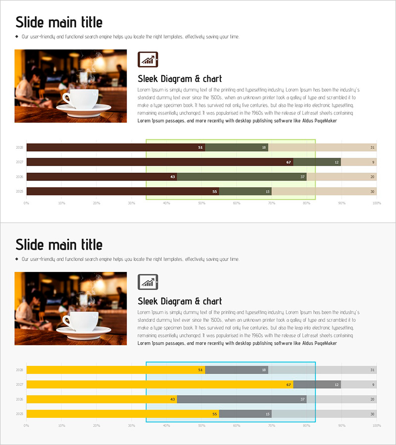
A horizontal bar chart PowerPoint slide comparing annual coffee consumption across four years (2019–2022). The slide uses three data series in brown, green, and beige colors, with clear numerical labels on each bar. Designed in 16:9 widescreen format with 2 slides, this presentation template is ready for business performance analysis, market trend reporting, and competitive benchmarking. The editable chart structure allows quick adaptation for sales volume, consumption metrics, or performance indicators across various industries.
Usage Points
-
Main Usage
Visualizes multi-year consumption, sales, or performance metrics using horizontal bar format. Enables quick comparison of four annual data points, making it ideal for business performance reports, market trend analysis, and competitive positioning in executive presentations.
-
How to Use
Bar length and color differentiate data magnitude and series. Numerical labels provide exact values for precise communication. Maintain the color scheme while replacing data values to repurpose the template across industries and topics.
-
Recommended For
Suitable for business strategy presentations, market analysis sections in marketing plans, performance metrics in investor pitch decks, and quarterly/annual reports. Particularly effective for beverage, retail, consumer goods, and distribution industry sales presentations.
-
Slide Structure
2-slide deck featuring horizontal bar charts with 4 annual data points (2019–2022) per slide. Three color series (brown, green, beige) distinguish data categories, with numerical labels at bar ends. Horizontal axis scaled 0–100% supports ratio-based comparison and percentage analysis.
Related Products
-

Yellow Green Detailed Analysis Chart - Visualizing Market Trends
#Business Strategy #Market and Competitor Analysis #Diagram
-

Stacked Bar Graph for Growing Market Trends – Business Strategy
#Business Strategy #Market and Competitor Analysis #Graph
-

Accumulated Horizontal Graphs Inside Nature – Market Trend Analysis
#Business Strategy #Market and Competitor Analysis #Graph
-

Comparison Graph of Business Trends by Year – Performance and Market Trends
#Business Strategy #Market and Competitor Analysis #Graph
