The Importance of Modern People's Health Care – Insights from Market Analysis
RJ0800025_12
- Last Update 08/06/2025
- File Size 1MB
- # of Slides 2
- File Format PPTX
- Slide Ratio 16:9
- Color
Keywords
- #Content-Based Slides
- #Design-Based Slides
- #Market and Competitor Analysis
- #Graph
- #Other
- #Market Status
- #Competitive Advantage
- #Column
- #Grouped Column
- #16:9
- #grouped bar chart PowerPoint
- #multi-series data visualization slide
- #comparison chart template
- #market analysis graph PowerPoint
- #4-series bar chart slide template
About the Product
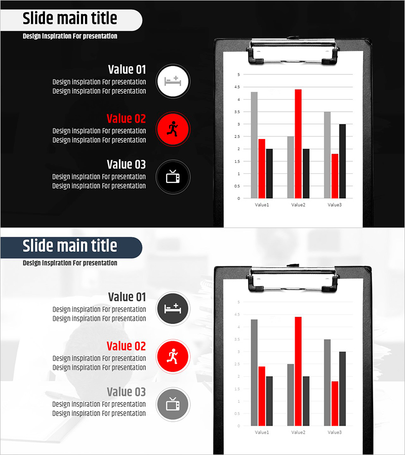
A 2-slide PowerPoint template set for health care market analysis featuring grouped bar charts. The first slide uses a black background with white typography, displaying 3 categories (Value01, Value02, Value03) across 4 data series in horizontal bar format, with red accent series highlighting key metrics. The second slide presents the same data structure on a light background for print and online presentation flexibility. Both slides feature a left-side text description area for each Value item and a right-side clipboard mockup with the chart, making it immediately applicable to business reports and marketing analysis presentations.
Usage Points
-
Main Usage
Compare multiple data series across several categories for market analysis and competitive benchmarking. Visualize health care, medical, and wellness industry statistics clearly to support decision-making and strategic planning.
-
How to Use
Enter category descriptions (targets, achievements, metric names) in the left text area for each Value item, then update the chart data values with your actual figures. Use the black background version for projector presentations and the light background version for printing and email distribution.
-
Recommended For
Marketing managers, market analysts, business executives, health care administrators, and wellness company planning teams. Ideal for quarterly performance comparisons, market share analysis, customer satisfaction survey results, and any data-driven communication requiring quantitative visualization.
-
Slide Structure
Each slide contains a left-side 3-row text box area (Value01, Value02, Value03) plus a right-side clipboard mockup with horizontal bar chart. The chart displays X-axis range 0–5, Y-axis with 3 categories, and 4 data series (gray, black, red, gray) with red series emphasized as the primary metric.
Related Products
-

Study Area Chart - Market Status and Competitive Advantage
#Market and Competitor Analysis #Graph #Other
-

Meat and Vegetable Consumption by Region – Market Status Analysis
#Market and Competitor Analysis #Graph #Other
-

Five Color Powerpoint Template Wide – Charts and Mockups
#Market and Competitor Analysis #Graph #Other
-

Market Competition and Analysis Graphs – Enhance Business Advantage
#Market and Competitor Analysis #Graph #Other
