Comparison of Travel Distances – Performance and Analysis
RJ0800036_13
- Last Update 08/10/2025
- File Size 7.1MB
- # of Slides 2
- File Format PPTX
- Slide Ratio 16:9
- Color
Keywords
- #Content-Based Slides
- #Design-Based Slides
- #Business Strategy
- #Graph
- #Achievements
- #Horizontal Bar
- #Horizontal Bar Chart
- #16:9
- #horizontal bar chart PowerPoint
- #travel distance comparison slide
- #performance analysis presentation
- #year-over-year data visualization
- #business metrics PowerPoint template
About the Product
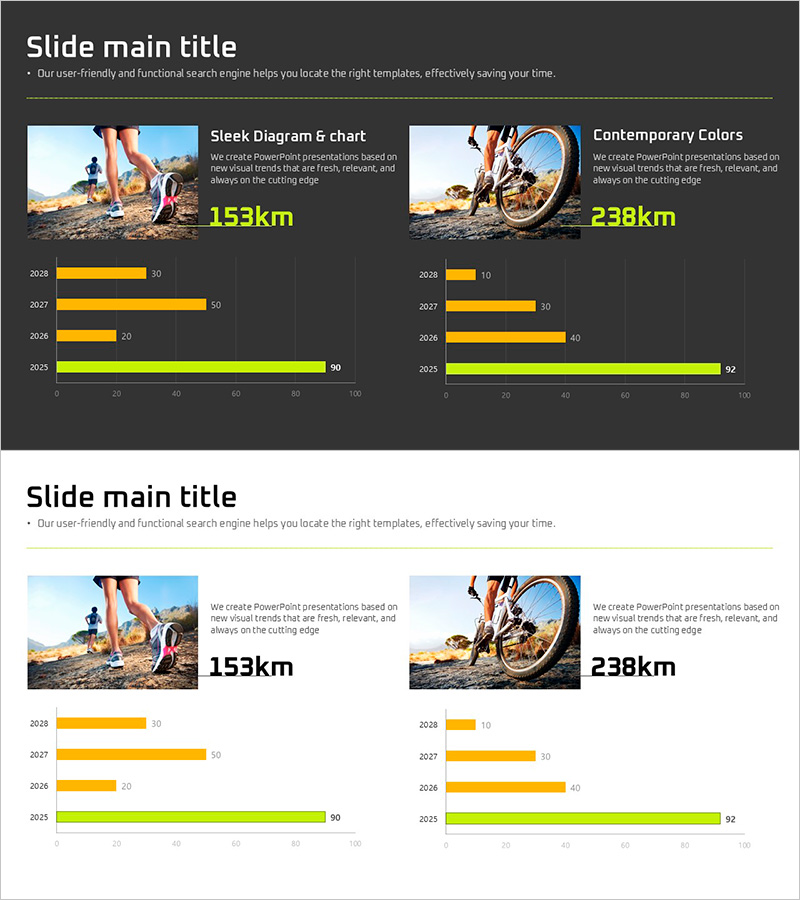
A 2-slide PowerPoint presentation comparing travel distances across four years (2028–2025) using horizontal bar charts. The slides combine real-world photography with numerical data, visualizing performance trends through yellow and lime-green bar series. Each slide features a clean layout with image integration and data labels, making it ideal for business performance reports, quarterly reviews, and strategic initiative presentations. Delivered in 16:9 widescreen PPTX format for universal compatibility.
Usage Points
-
Main Usage
Visualize year-over-year performance metrics using horizontal bar charts to compare travel distances, sales volumes, or visit counts. Ideal for executive briefings, quarterly performance reviews, and strategic business presentations where clear data comparison is essential.
-
How to Use
Replace the sample data values and bar lengths with your actual metrics. Maintain the yellow and lime-green color scheme or customize to match your corporate branding. Edit the title and subtitle text to reflect your presentation topic, then the slides are ready to present.
-
Recommended For
Executive reports, quarterly performance reviews, business strategy presentations, marketing performance analysis, sales results reporting, and project status updates. Particularly effective for investor presentations and management meetings requiring year-over-year performance comparison.
-
Slide Structure
Two-slide layout with title and subtitle area at the top, photograph image on the left, and horizontal bar chart on the right. The chart displays four years of data (2028, 2027, 2026, 2025) in yellow and lime-green series with numerical labels at the end of each bar for precise value comparison.
Related Products
-

Preferred Menu Survey Visualization with Horizontal Bar Chart
#Company Introduction #Business Strategy #Graph
-

Bar Chart Visualizing Housing Preferences Survey
#Business Strategy #Market and Competitor Analysis #Graph
-

Strategic Goal Progress Template
#Business Strategy #Diagram #Graph
-

Results of Preference Survey by Beer Product – Utilizing Horizontal Bar Graph
#Business Strategy #Financial Plans and Performance #Graph
