Popular Snack Graph for Revenue Visualization – Simplicity and Intuition
RJ0800013_26
- Last Update 08/03/2025
- File Size 0.4MB
- # of Slides 2
- File Format PPTX
- Slide Ratio 16:9
- Color
Keywords
- #Content-Based Slides
- #Design-Based Slides
- #Business Strategy
- #Financial Plans and Performance
- #Graph
- #Achievements
- #Sales and Revenue
- #Horizontal Bar
- #Horizontal Bar Chart
- #16:9
- #horizontal bar chart PowerPoint
- #data comparison slide template
- #bar graph presentation
- #sales performance visualization
- #PowerPoint chart slide download
About the Product
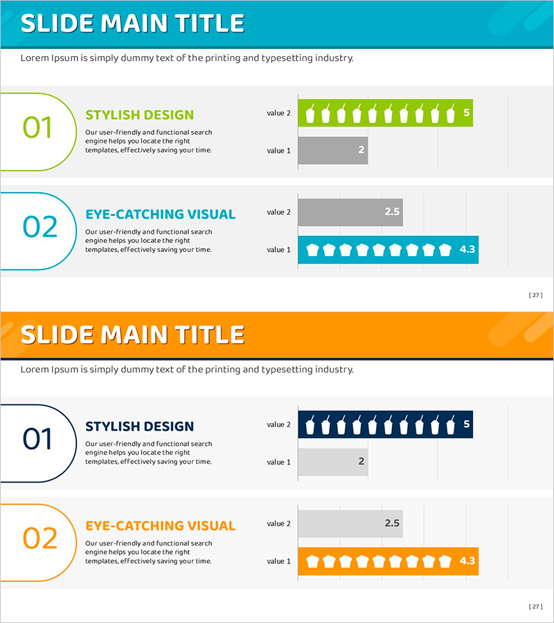
A PowerPoint slide deck featuring horizontal bar charts to visualize popular snack sales performance and revenue data. The 2-slide set presents two data series side-by-side using green, blue, and orange color schemes. Each slide includes a numbered section (01, 02) with a dedicated title area for clear presentation flow. The horizontal bar layout makes numerical comparisons intuitive and helps audiences quickly grasp performance metrics. Ideal for business reports, financial presentations, and data-driven decision-making discussions.
Usage Points
-
Main Usage
This horizontal bar chart slide is optimized for comparing numerical values and ranking data across categories. The side-by-side arrangement of two data series enables audiences to instantly recognize performance differences, making it ideal for sales comparisons, market analysis, and financial reporting.
-
How to Use
Use in quarterly business performance reports, marketing campaign analysis presentations, financial results briefings, and executive-level business reviews. Simply edit the title section with your analysis topic and replace bar lengths and numerical values with actual data. The template is ready for immediate presentation use.
-
Recommended For
Sales teams presenting quarterly results, marketing departments analyzing campaign performance, finance teams reporting budget execution, and executives delivering business performance updates. Suitable for any data-driven business presentation requiring numerical comparison and ranking visualization.
-
Slide Structure
Two-slide layout with title area, numbered sections (01/02), and two-series horizontal bar charts on each slide. First slide uses green and blue backgrounds; second slide features orange background for visual variety. Each bar includes numerical labels ensuring accurate data communication and professional presentation appearance.
Related Products
-

Revenue Breakthrough: Achieving All-Time Highs with Bar Graphs
#Business Strategy #Financial Plans and Performance #Graph
-

Striking Performance Gap in Agricultural Outcomes
#Business Strategy #Financial Plans and Performance #Graph
-

Results of Preference Survey by Beer Product – Utilizing Horizontal Bar Graph
#Business Strategy #Financial Plans and Performance #Graph
-

Furniture Sales Performance Graph – Business Strategy Achievement
#Business Strategy #Financial Plans and Performance #Graph
