Market Analysis Chart for Frequently Used Transportation Methods When Traveling
RJ0600035_15
- Last Update 06/30/2025
- File Size 0.5MB
- # of Slides 2
- File Format PPTX
- Slide Ratio 16:9
- Color
Keywords
- #Content-Based Slides
- #Design-Based Slides
- #Business Strategy
- #Market and Competitor Analysis
- #Graph
- #Achievements
- #Competitive Advantage
- #Horizontal Bar
- #Horizontal Bar Chart
- #16:9
- #horizontal bar chart PowerPoint
- #market analysis chart template
- #5-item comparison slide
- #transportation market analysis
- #how to create bar chart in PowerPoint
About the Product
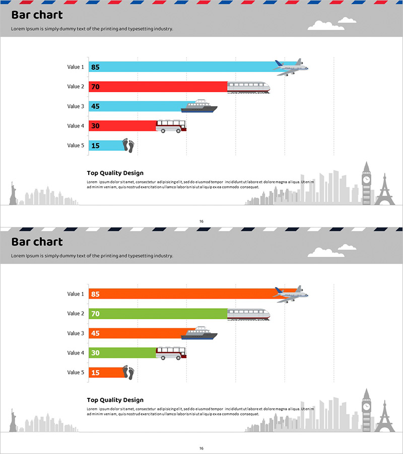
A horizontal bar chart PowerPoint slide for comparing and analyzing the market size of transportation methods used during travel. Visualizes five transportation modes—airplane, train, ship, bus, and walking—with quantitative data, featuring transportation icons next to each bar for intuitive understanding. Alternating cyan and red bars clearly distinguish items, while grid background facilitates numerical reading. Ready to use in presentations requiring comparative analysis of market share, usage frequency, or revenue by transportation type.
Usage Points
-
Main Usage
Quantitative data visualization for market size comparison in travel, tourism, and transportation industries. Express usage frequency, revenue, or market share by transportation mode through bar length for intuitive decision-making support.
-
How to Use
Insert into market analysis, competitive comparison, or business status sections of presentations. Edit bar values with actual data and replace item names and icons as needed for diverse comparative analysis charts.
-
Recommended For
Executive reports for tourism boards, airlines, railways, shipping, and bus companies; policy briefings for transportation officials; market analysis presentations for travel agencies and OTA platforms; business school and tourism program lectures.
-
Slide Structure
Two-slide set. First slide features alternating cyan and red bars (5 items: Values 85, 70, 45, 30, 15) with transportation icons on the right. Second slide uses alternating orange and green bars with identical structure. Grid background and numerical labels support accurate data reading.
Related Products
-

Horizontal Bar Graph of Component Analysis Results
#Business Strategy #Market and Competitor Analysis #Graph
-

Performance Analysis of the Second-Ranked Item – Towards Successful Strategies
#Business Strategy #Market and Competitor Analysis #Graph
-

Eco-friendly Icon Bar Graph – Effective Visualization for Market Analysis
#Business Strategy #Market and Competitor Analysis #Graph
-

Bar Chart Analysis of Gardening Activities Trend – Performance and Competitive Advantage
#Business Strategy #Market and Competitor Analysis #Diagram
