Abstract Pattern Doughnut Chart for Sales Analysis – Emphasizing Financial Performance
RJ0200033_25
- Last Update 04/07/2025
- File Size 0.3MB
- # of Slides 2
- File Format PPTX
- Slide Ratio 16:9
- Color
Keywords
- #Content-Based Slides
- #Design-Based Slides
- #Financial Plans and Performance
- #Diagram
- #Graph
- #Sales and Revenue
- #Table
- #Circles
- #Standard Table
- #Doughnut Chart
- #16:9
- #doughnut chart PowerPoint
- #pie chart slide template
- #sales analysis visualization
- #financial performance chart
- #ratio presentation slide
About the Product
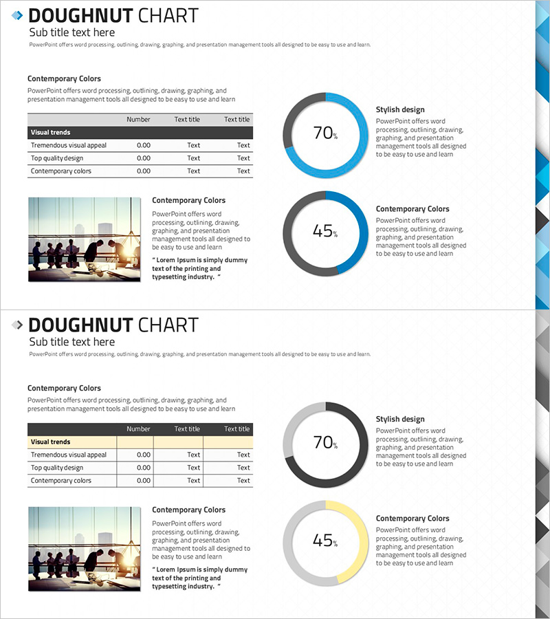
A professional doughnut chart PowerPoint slide designed for financial performance and sales analysis visualization. This 2-slide set displays two data ratios (70% and 45%) in a dual-tone blue and gray color scheme that emphasizes credibility and expertise. The abstract pattern background integrates seamlessly with table, image, and text areas, making it ready for immediate use in financial reports, performance presentations, and business analysis materials. Formatted in 16:9 widescreen PPTX for universal compatibility across all presentation environments.
Usage Points
-
Main Usage
Clearly visualize financial performance metrics and sales composition ratios using doughnut chart graphics. The hollow center allows emphasis of key figures or titles, while dual data representations (70% and 45%) enable effective comparative analysis and multi-metric reporting.
-
How to Use
Insert this slide into financial reports' performance sections, business analysis presentations, or quarterly sales updates. Replace sample data with actual figures, add relevant photographs to image areas, and customize text boxes with your analysis insights to create a polished presentation.
-
Recommended For
Ideal for CFOs and finance managers presenting quarterly results, executive-level financial analysis, investor relations meetings, and marketing team sales performance sharing. Particularly suited for data-driven decision-making meetings, board presentations, and shareholder communications.
-
Slide Structure
Two-slide layout with one doughnut chart per slide. First slide features a blue-toned 70% ratio chart; second slide displays a gray-toned 45% ratio chart. Each slide uses a two-column layout with table and image areas on the left, chart and text description areas on the right, ensuring clear information hierarchy.
Related Products
-

Liquor Sales Chart – Market Analysis and Performance Management
#Market and Competitor Analysis #Financial Plans and Performance #Diagram
-

Simple Circle Presentation Template Doughnut Chart – Visualizing Financial Performance
#Financial Plans and Performance #Diagram #Graph
-

Business Sales and Profit Calculation Table – Essential Slide for Financial Planning
#Financial Plans and Performance #Diagram #Income Statement
-

Business Income Statement Table – An Essential Tool for Performance Analysis
#Financial Plans and Performance #Diagram #Income Statement
