Compare Three Curve Chart Trends
RJ0800030_23
- Last Update 08/08/2025
- File Size 3.6MB
- # of Slides 2
- File Format PPTX
- Slide Ratio 16:9
- Color
Keywords
- #Content-Based Slides
- #Design-Based Slides
- #Market and Competitor Analysis
- #Financial Plans and Performance
- #Graph
- #Competitive Advantage
- #Sales and Revenue
- #16:9
- #line chart PowerPoint slide
- #3-line trend comparison chart
- #stacked line chart design
- #financial data visualization PPT
- #how to create trend analysis in PowerPoint
About the Product
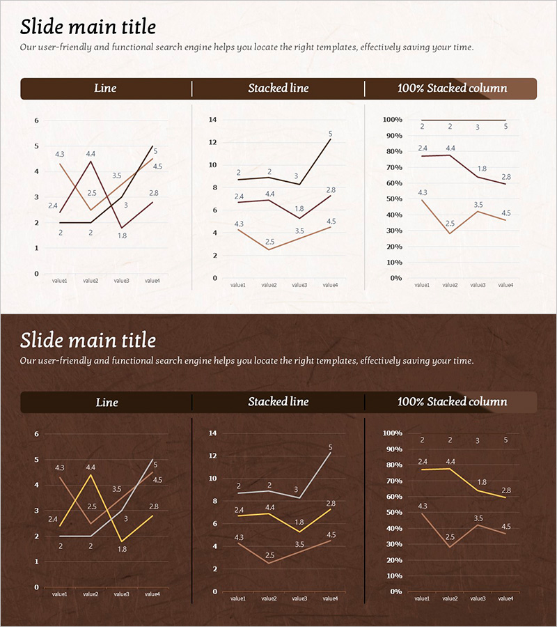
A PowerPoint slide set featuring three line chart variations to compare multiple data series simultaneously. Includes standard line chart, stacked line chart, and 100% stacked column chart, presented in both light beige and dark brown background color schemes. Each chart displays four data points (value1 through value4) with clearly labeled numerical values, making it immediately applicable for financial analysis, market trend reporting, and sales performance comparison. Provided in 16:9 PPTX format with fully editable text and data fields for seamless integration into presentations.
Usage Points
-
Main Usage
Designed to simultaneously compare and visualize three or more time-series data sets such as financial metrics, sales performance, or market share trends. The stacked line and 100% stacked column options enable representation of both absolute values and relative proportions, making it highly suitable for executive decision-making materials.
-
How to Use
Use in IR presentations, business reports, and marketing analysis documents within financial and performance sections to explain quarterly or annual trends. Simply modify the slide title, legend, and numerical labels to match your data, then the slide is ready for immediate presentation use.
-
Recommended For
CFOs, financial analysts, marketing strategists, and business development managers presenting quarterly reports or strategic reviews. Particularly effective for comparing quarterly performance metrics, competitive market share evolution, and product-line revenue trends across multiple periods.
-
Slide Structure
One title area, three chart sections (standard line, stacked line, 100% stacked column), with four editable data points per chart. Legend, axis labels, and value annotations are all customizable. The brown background version conveys a professional, premium report aesthetic suitable for executive presentations.
Related Products
-

Highlighted Vertical Bar Graph (Green & Orange) – Clear Visualization for Data Comparison
#Market and Competitor Analysis #Financial Plans and Performance #Graph
-

Slide Visualizing Sales Performance Trend in the Kids Market
#Market and Competitor Analysis #Financial Plans and Performance #Graph
-

Competitor Market Analysis Graph – Financial Performance and Competitive Advantage
#Market and Competitor Analysis #Financial Plans and Performance #Diagram
-

Rising Section Blue Line Chart - Sales and Revenue Analysis
#Market and Competitor Analysis #Financial Plans and Performance #Graph
