Brown Line Chart Analysis – Market Competitive Advantage
RJ0800030_11
- Last Update 08/08/2025
- File Size 3.6MB
- # of Slides 2
- File Format PPTX
- Slide Ratio 16:9
- Color
Keywords
About the Product
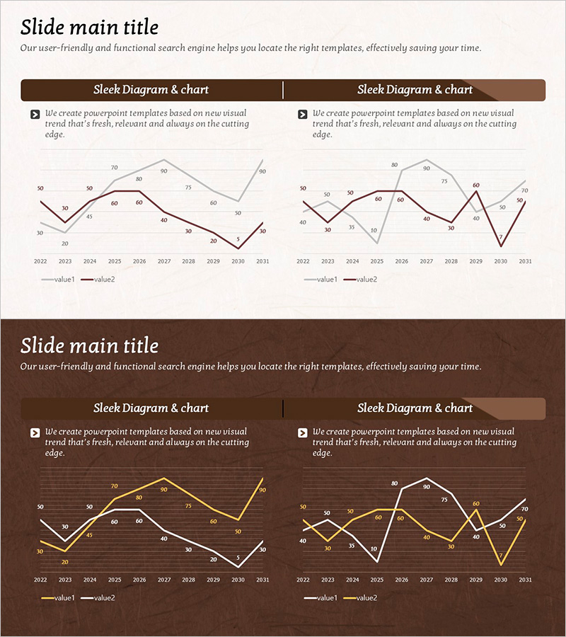
A dual-series line chart PowerPoint slide comparing market data from 2022 to 2031 across two value streams. Set against a brown-toned background, this presentation slide features clear data points, gridlines, and legend labels to effectively communicate competitive analysis, market share evolution, and revenue trends over time. The 16:9 widescreen format with 2-slide layout is ready for immediate use in business presentations, and all numerical values and series names are fully editable to match your specific dataset.
Usage Points
-
Main Usage
Visualize numerical changes over time by comparing two or more data series, making it ideal for market dynamics, competitive benchmarking, revenue growth, and customer acquisition trends. The brown-toned design conveys professionalism and data credibility, perfect for executive reports and investor presentations.
-
How to Use
Replace the sample data points (50–80 range) and years (2022–2031) with your actual figures. Rename the series labels (value1, value2) to competitor names, product lines, or regional identifiers. Adjust line colors and thickness as needed to emphasize key comparisons.
-
Recommended For
Executive quarterly and annual performance reports, investor relations (IR) presentations, marketing team market share analysis, sales team competitive benchmarking, and consulting firm trend analysis decks.
-
Slide Structure
2-slide set featuring dual-series line charts with a 10-year timeline (2022–2031) on the x-axis and a 0–80 numerical scale on the y-axis. Clear legend and data labels enable straightforward interpretation of trends and comparative performance.
Related Products
-

Vegetable Market Status Analysis with Line Charts
#Market and Competitor Analysis #Graph #Market Status
-

Annual Investment Analysis Graph – Competitor Analysis and Cluster Visualization
#Market and Competitor Analysis #Diagram #Graph
-

Competition Graphs and Analysis – Slides for Market Advantage
#Market and Competitor Analysis #Graph #Competitor Analysis
-

Graph Analysis by Year Sales
#Market and Competitor Analysis #Financial Plans and Performance #Graph
