Parallelogram Graph & Table – Visualizing Product/Service Introduction and Financial Performance
RJ0300049_13
- Last Update 05/01/2025
- File Size 1.6MB
- # of Slides 2
- File Format PPTX
- Slide Ratio 16:9
- Color
Keywords
- #Content-Based Slides
- #Design-Based Slides
- #Product/Service Introduction
- #Financial Plans and Performance
- #Diagram
- #Graph
- #Development Status
- #Sales and Revenue
- #Table
- #Other
- #Standard Table
- #Other Charts
- #16:9
- #parallelogram graph PowerPoint
- #ratio data visualization slide
- #tilted chart template
- #financial performance PPT
- #product comparison slide design
About the Product
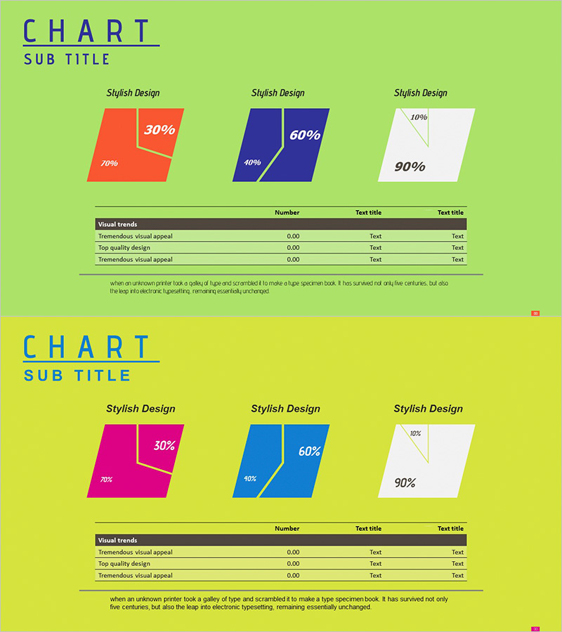
A PowerPoint slide deck featuring parallelogram-shaped charts for comparing product introductions and financial performance at a glance. The tilted geometric shapes are rendered in three distinct color schemes—coral red, navy blue, and light gray—to intuitively represent ratio-based data. A data table below each chart accommodates detailed metrics and descriptions. Delivered as 2 slides in 16:9 widescreen format, each page applies a different color combination to enhance presentation variety. The angled geometric form conveys a contemporary aesthetic while optimizing numerical decision-making materials. Fully editable shapes and text fields allow seamless customization for quarterly reports, performance reviews, and investor presentations.
Usage Points
-
Main Usage
Express product, service, and financial performance data through tilted parallelogram charts to simultaneously compare ratios and analyze outcomes. The geometric angle creates a dynamic, contemporary presentation atmosphere, while the data table below provides concrete figures and descriptions to enhance credibility and stakeholder confidence.
-
How to Use
Enter percentage values (30%, 60%, 90%, etc.) inside each parallelogram shape and input actual metrics in the 'Number' column of the table below. Use distinct colors to differentiate product categories, departments, or time periods. Add item names in the 'Text title' field to clarify data context and improve audience comprehension.
-
Recommended For
Ideal for finance teams presenting quarterly or annual performance reports, marketing teams analyzing product sales ratios, executive-level business status briefings, and investor presentations. Particularly effective for C-suite reports and board meetings where ratio-based data emphasis is critical.
-
Slide Structure
Comprises 2 slides, each featuring 3 parallelogram charts (left coral, center navy, right light gray) with a data table below (Visual trends header + 3 data rows). Charts include embedded percentage labels and annotations. The table contains 2 columns: Number and Text title, enabling flexible data entry and customization.
Related Products
-

Origami Presentation Template Section Table – Showcase Financial Performance
#Financial Plans and Performance #Diagram #Cash Flow Statement
-

Orange Hexagon Presentation Template Table – Visualization of Revenue and Profit
#Financial Plans and Performance #Diagram #Sales and Revenue
-

Visualizing Business Strategies with Tables & Charts – Clear Data Presentation
#Business Strategy #Financial Plans and Performance #Diagram
-

Typographic Wide Template Bar Chart & Table – Competitive Analysis and Performance
#Market and Competitor Analysis #Financial Plans and Performance #Diagram
