Visualizing Annual Sales Performance Trends - Graph Slide
RJ0800027_15
- Last Update 08/07/2025
- File Size 0.2MB
- # of Slides 2
- File Format PPTX
- Slide Ratio 16:9
- Color
Keywords
- #Content-Based Slides
- #Design-Based Slides
- #Business Strategy
- #Financial Plans and Performance
- #Graph
- #Achievements
- #Sales and Revenue
- #Line
- #Line Chart
- #16:9
- #line chart PowerPoint slide
- #sales trend visualization
- #annual performance graph
- #financial data presentation template
- #trend analysis slide
- #how to create line chart in PowerPoint
About the Product
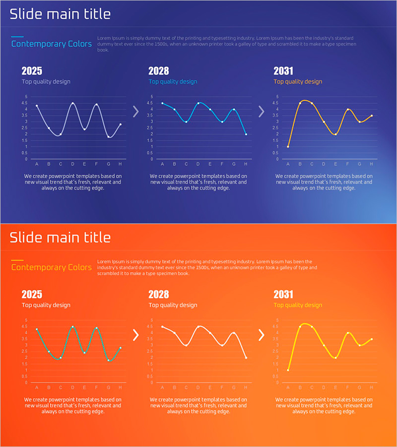
A line chart PowerPoint slide comparing annual sales performance trends across three time periods (2025, 2028, 2031). The slide visualizes eight data points connected by trend lines in white, cyan, and gold colors on a dark blue background, making sales change patterns immediately clear. Each slide includes a description text area at the bottom for seamless integration into financial reports, performance analyses, and executive presentations. Delivered as a 16:9 PPTX file with 2 slides.
Usage Points
-
Main Usage
Visualize annual, quarterly, or monthly sales performance, market trends, and achievement tracking data as time-series changes. Compare multiple data series simultaneously to identify growth rates, declines, and volatility patterns. Ideal for financial analysis, executive reporting, and marketing performance presentations.
-
How to Use
Enter your analysis title in the slide header and update the legend labels (2025, 2028, 2031) to match your actual time periods. Modify data point values to automatically update the trend lines, then add analysis results and insights in the description text area to complete your presentation.
-
Recommended For
Finance professionals, executives, and marketing teams presenting quarterly or annual performance results. Recommended for investor presentations, business plans, management reports, market analysis, and competitive benchmarking. Particularly effective for executive briefings and board-level materials emphasizing long-term trend changes.
-
Slide Structure
2-slide set with dark blue background. Each slide features a header area for title and subtitle, a central line chart with Y-axis (0–5 range) and X-axis (8 items A–H), and a description text area at the bottom. Three trend lines (white, cyan, gold) distinguish data series by time period. One additional orange background slide provides color contrast options.
Related Products
-

Red Green Line Chart – Sales and Performance Analysis
#Business Strategy #Financial Plans and Performance #Graph
-

Highlighting Key Data Points in Trends – Performance and Vision
#Business Strategy #Financial Plans and Performance #Graph
-

Kids Drawing Line Graph – Emphasizing Performance
#Business Strategy #Financial Plans and Performance #Graph
-

Key Performance Graphs – Business Strategy and Performance
#Business Strategy #Financial Plans and Performance #Graph
