Visualize Performance with Line Graph Trends – Business Strategy
RJ0500016_14
- Last Update 06/11/2025
- File Size 0.5MB
- # of Slides 2
- File Format PPTX
- Slide Ratio 16:9
- Color
Keywords
- #Content-Based Slides
- #Design-Based Slides
- #Business Strategy
- #Financial Plans and Performance
- #Graph
- #Achievements
- #Sales and Revenue
- #Line
- #Line Chart
- #16:9
- #line chart PowerPoint
- #dual-series trend comparison
- #5-year performance slide
- #revenue trend visualization
- #how to create line graph in PowerPoint
About the Product
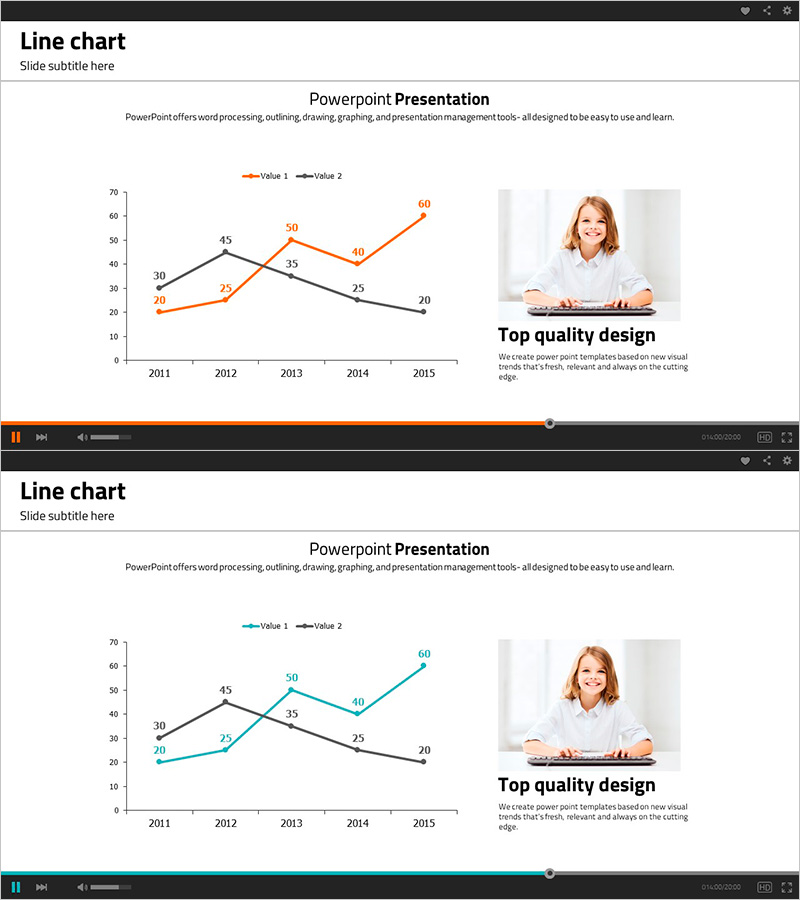
A dual-series line chart PowerPoint slide that visualizes data trends across a 5-year period with two distinct data lines. Orange and black line series intersect and diverge to show comparative performance patterns, with explicit data points (30, 45, 50, 40, 60, etc.) clearly labeled at each year. Ideal for business performance analysis, revenue trends, financial planning, and strategic reporting. The 2-slide deck in 16:9 widescreen format is ready to integrate into presentations and business reports without additional design work.
Usage Points
-
Main Usage
Compares two or more data series over time to reveal performance trends, revenue patterns, and financial metrics at a glance. Commonly used in executive reports, business strategy presentations, investor pitches, and quarterly performance reviews to communicate key performance indicators persuasively.
-
How to Use
Replace the data points and axis labels with your own figures. Customize the orange and black line colors to match your corporate brand identity, update the legend and title, and adapt the chart to fit various business contexts. All elements are fully editable in PowerPoint.
-
Recommended For
Finance professionals, executives, marketing managers, business strategists, consultants, and analysts who need to present quantitative data to senior leadership or external stakeholders. Suitable for quarterly reviews, annual business planning presentations, investor relations meetings, and performance dashboards.
-
Slide Structure
Both slides follow an identical layout: title and subtitle at the top, a dual-series line chart in the center (spanning 2011–2015 with 5 data points per series), and a professional photo with 'Top quality design' caption on the right side.
Related Products
-

Red Green Line Chart – Sales and Performance Analysis
#Business Strategy #Financial Plans and Performance #Graph
-

Kids Drawing Line Graph – Emphasizing Performance
#Business Strategy #Financial Plans and Performance #Graph
-

Performance Analysis Visualization with Line Graph – Challenge and Success
#Business Strategy #Financial Plans and Performance #Graph
-

Geometric Pattern Wide PowerPoint Line Chart – Business Performance Analysis
#Business Strategy #Financial Plans and Performance #Graph
