Three-Color Line Graph to Visualize Performance – Emphasizing Business Strategy
RJ0800026_21
- Last Update 08/06/2025
- File Size 0.4MB
- # of Slides 2
- File Format PPTX
- Slide Ratio 16:9
- Color
Keywords
About the Product
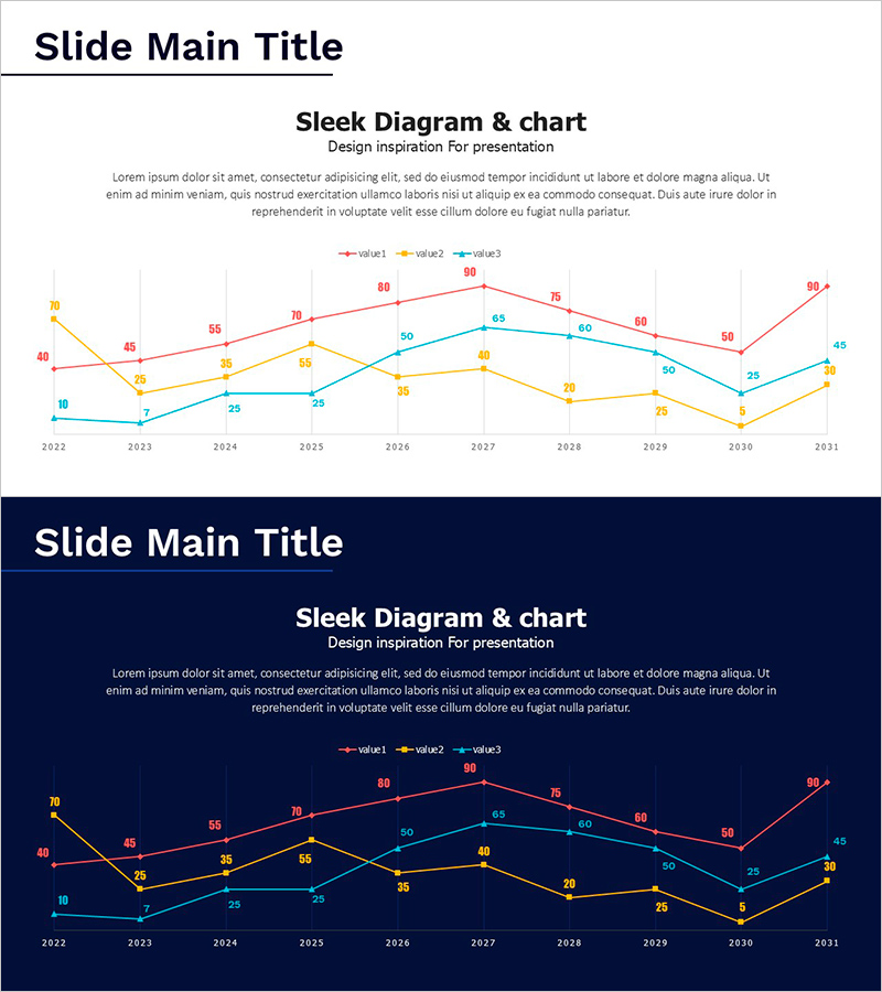
This free PowerPoint slide features three line charts in pink, gold, and teal, allowing you to compare three data indicators simultaneously across a 10-year timeline from 2022 to 2031. Each data point is labeled with its value, making it easy for your audience to track changes at a glance. The slide comes in two versions: a light version with a white background and a dark version with a deep navy background, so you can choose the one that best fits your presentation environment. Provided in PPTX format, this single slide can be inserted directly into annual performance reports, business plan financial trend sections, marketing performance decks, or investor pitch presentations. Simply replace the axis labels, data values, and legend names with your own figures to complete the slide. For a wider collection of line chart and graph slides, explore the full library at GoodPello.
Usage Points
-
Main Usage
Designed to visualize time-series data across three indicators simultaneously, this slide is ideal for presenting annual performance trends, growth metrics, or multi-variable comparisons in business reports and investor presentations.
-
How to Use
Replace the X-axis year labels, data point values, and legend names with your actual figures. Choose between the light (white background) or dark (navy background) version depending on your presentation setting, then insert the slide into your deck.
-
Recommended For
Best suited for finance and strategy professionals preparing annual reports, startup founders presenting growth metrics to investors, marketers visualizing campaign performance over time, and business planners including financial trend data in their proposals.
-
Slide Structure
Single-slide layout with three sections: title and subtitle area at the top left, descriptive text block in the center, and a multi-line chart at the bottom featuring 3 color-coded lines, 10 data points each, and a legend. Includes both light (white) and dark (navy) background versions.


