Data Visualization with Bar Charts – Presentation for Efficient Choices
RJ0500045_7
- Last Update 06/19/2025
- File Size 0.3MB
- # of Slides 2
- File Format PPTX
- Slide Ratio 16:9
- Color
Keywords
About the Product
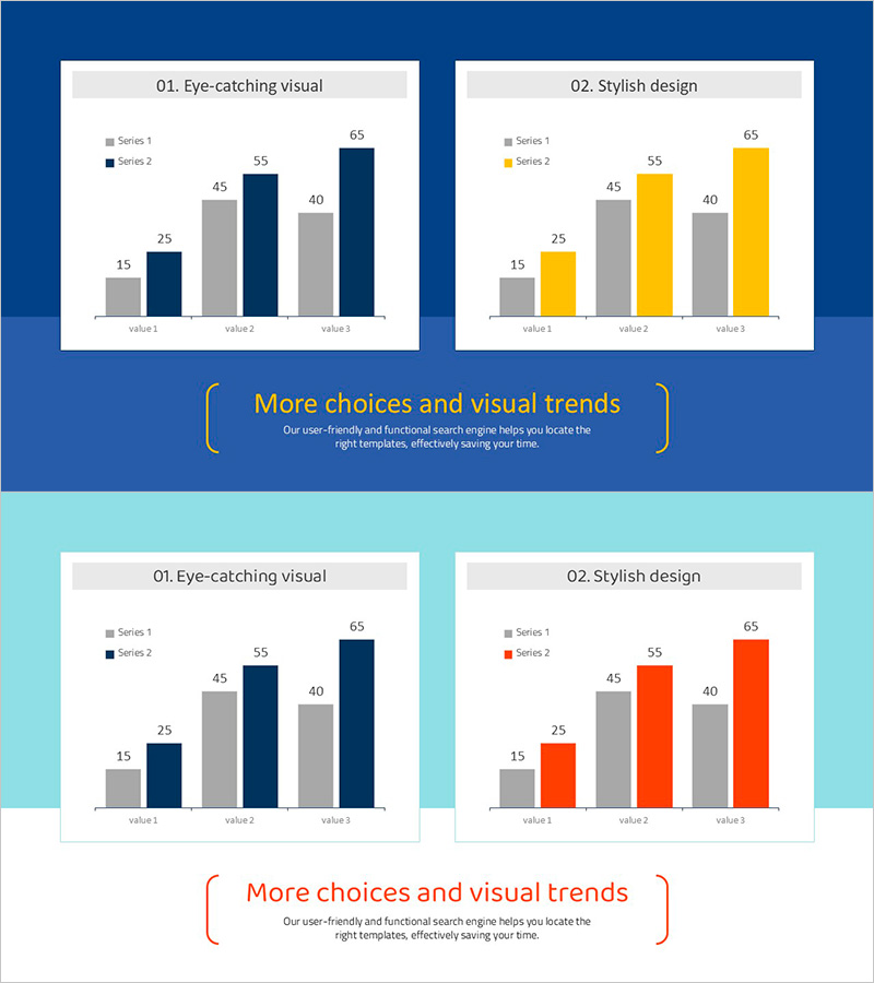
This free PowerPoint slide features a grouped vertical bar chart layout with three accent color options: navy blue, gold yellow, and orange red. The slide is divided into two side-by-side panels, each displaying a two-series (gray and accent color) bar chart across three data categories. Data labels are pre-placed on each bar, so you only need to update the values to complete your presentation. A gray header label at the top and a decorative bracket text area at the bottom allow you to add a slide title and supporting description. This PPT slide is ready to insert into the data comparison section of business reports, marketing plans, or pitch decks. Download the PPTX file for free and edit it directly in PowerPoint. For a wider variety of graph slides, explore GoodPello's premium graph slide collection.
Usage Points
-
Main Usage
Designed to visually compare two data series across three categories in the data analysis or performance comparison section of business reports, marketing plans, and pitch decks.
-
How to Use
Replace the numeric labels and axis category names in both chart panels with your actual data, then choose the navy, gold, or orange accent color version that best matches your presentation theme.
-
Recommended For
Business professionals, marketers, and planners who need a clean data comparison slide, as well as analysts preparing market research or performance review presentations on a tight deadline.
-
Slide Structure
Single-slide layout with two grouped vertical bar charts placed side by side, each containing 2 data series and 3 category axes, plus a gray header label per panel and one shared bracket-style title and description text area at the bottom.
Related Products
-

Market Analysis Graph – Harmony of Pink and Bluegreen
#Free Graphs
-

Competitive Advantage Bar General Graph – Emphasizing Performance through Market Analysis
#Free Graphs
-

Competitor Analysis and Market Trend Graph – Blue, Orange, Green Colors
#Free Graphs
-

Bar Chart of Decline & Rise Analysis – Emphasizing Market Competitiveness
#Free Graphs
