Horizontal Bar Chart for Accident Status Visualization – Optimizing Data Comparison
RJ0800023_6
- Last Update 08/06/2025
- File Size 1MB
- # of Slides 2
- File Format PPTX
- Slide Ratio 16:9
- Color
Keywords
- #Content-Based Slides
- #Design-Based Slides
- #Market and Competitor Analysis
- #Graph
- #Other
- #Market Status
- #Horizontal Bar
- #Horizontal Bar Chart
- #Map
- #16:9
- #Europe map PowerPoint slide
- #regional data visualization
- #horizontal bar chart template
- #country comparison slide
- #geographic data presentation
- #global market analysis PPT
About the Product
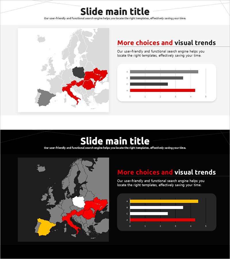
A 2-slide PowerPoint presentation combining a Europe map with horizontal bar charts for regional data comparison. Available in both light and dark background versions, with countries highlighted in red, yellow, and gray tones to emphasize regional performance. The map on the left shows geographic distribution while the right side displays corresponding numerical data in bar chart format. Ideal for business reports, market analysis, and global performance presentations. Fully editable in 16:9 widescreen PPTX format compatible with all PowerPoint versions.
Usage Points
-
Main Usage
Simultaneously display geographic location and numerical data on a single slide, combining spatial information with quantitative comparison. Ideal for market analysis, regional sales performance, country-level customer distribution, and global business strategy presentations.
-
How to Use
Highlight countries on the Europe map using color coding on the left side, then input corresponding numerical values in the horizontal bar chart on the right. Choose between light or dark background version based on your presentation environment and color scheme preference.
-
Recommended For
Marketing, sales, and executive reports analyzing European market conditions, regional revenue distribution, and country-specific performance metrics. Recommended for international business presentations, global strategy discussions, and geographic market analysis.
-
Slide Structure
Two-slide layout: Slide 1 features light background with gray, red, and black map tones plus gray and red bar charts. Slide 2 uses dark background with gray, red, and yellow map highlighting and white, red, and yellow bar chart elements.
Related Products
-

Meat and Vegetable Consumption by Region – Market Status Analysis
#Market and Competitor Analysis #Graph #Other
-

Target Country Market Analysis Graph
#Market and Competitor Analysis #Graph #Other
-

Test Tube Bar Graph for Market Analysis – Highlighting Competitive Advantage
#Market and Competitor Analysis #Graph #Market Status
-

Modern Business Presentation Template Map – Global Marketing Analysis
#Market and Competitor Analysis #Marketing Plan and Strategy #Graph
