Future Outlook Analysis with Horizontal Bar Chart – Business Strategy and Profitability Expectations
RJ0800020_5
- Last Update 08/05/2025
- File Size 0.2MB
- # of Slides 2
- File Format PPTX
- Slide Ratio 16:9
- Color
Keywords
About the Product
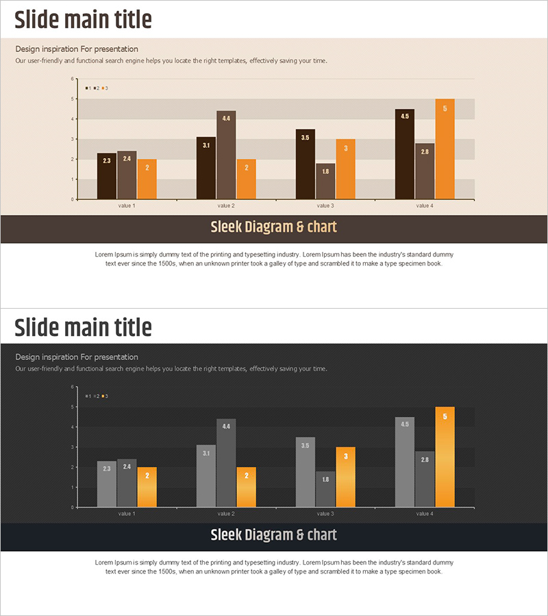
This free PowerPoint slide features a grouped vertical bar chart with a dark brown, gray, and orange three-color combination. Two color themes are included in a single PPTX file: a light version with a beige background and a dark version with a charcoal background, allowing you to choose the one that best fits your presentation environment. The 3-series × 4-group structure lets you compare up to 12 data points on a single slide, with numeric labels displayed above each bar for clear data readability. Simply replace the title, subtitle, group names, series labels, and numeric values with your actual data to complete a professional presentation slide instantly. This slide is ideal for data comparison sections in business plans, financial reports, market analysis decks, and quarterly performance presentations. For more grouped bar chart slides and other graph types, explore the full collection at GoodPello.
Usage Points
-
Main Usage
Designed to visually compare multiple data series across four categories on a single slide. The 3-series × 4-group grouped bar chart structure is ideal for presenting future outlooks, quarterly performance comparisons, and competitive benchmarking in business and financial presentations.
-
How to Use
Select either the light (beige background) or dark (charcoal background) theme to match your presentation setting. Replace the title, subtitle, group labels (value 1–4), series names (1–3), and numeric labels with your actual data. Bar colors can be freely adjusted in PowerPoint to match your brand guidelines.
-
Recommended For
Best suited for business planners, strategy teams, and finance professionals preparing data-driven presentations. Recommended for anyone who needs to compare multi-series data such as quarterly revenue, product line performance, or competitor metrics in a clear and structured visual format.
-
Slide Structure
Single-slide layout featuring a grouped vertical bar chart (3 series × 4 groups) as the main visual element. Includes a top title and subtitle area, a dark brown banner section for the slide title, and a bottom text description area. Two color themes (light and dark) are provided within one PPTX file.
Related Products
-

Vertical Bar Chart Visualizing Candidate Values – Trends and Choices
#Free Graphs
-

Business Comparison Analysis Graph – Strengthening Market and Competitor Analysis
#Free Graphs
-

Competitive Advantage Bar General Graph – Emphasizing Performance through Market Analysis
#Free Graphs
-

Market Analysis by Year Horizontal Bar Graph
#Free Graphs
