Horizontal Bar Comparison Graph – Effective Data Visualization
RJ0800020_11
- Last Update 08/05/2025
- File Size 0.2MB
- # of Slides 2
- File Format PPTX
- Slide Ratio 16:9
- Color
Keywords
About the Product
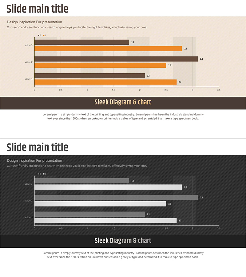
A PowerPoint slide featuring a horizontal bar chart comparing four data items with dual-series visualization. Brown and orange bar sets are displayed side-by-side to show two metrics per item simultaneously, such as year-over-year performance or competitive benchmarking. The light beige background with dark brown frame emphasizes data clarity and readability. Two slide versions—light tone and dark tone—accommodate different presentation environments and document styles. Ready-to-use for business reports, sales analysis, market comparisons, and performance reviews in presentations and printed materials.
Usage Points
-
Main Usage
Displays multiple data items as horizontal bars in parallel arrangement, enabling quick visual comparison of relative magnitudes and rankings. Dual-series bars (e.g., current vs. previous year, Product A vs. Product B) support simultaneous metric comparison, making it ideal for performance analysis, market benchmarking, and departmental results review.
-
How to Use
Select the light-tone slide for bright presentation venues and the dark-tone slide for dimly lit rooms or printed documents. Edit bar lengths and numerical labels to match your data, then add axis labels and legend text for context clarity. Maintain the color scheme while changing item names to repurpose the slide for various comparative analyses.
-
Recommended For
Executives, marketing teams, sales departments, finance teams, and consultants presenting quarterly results, regional sales figures, competitive analysis, or budget-versus-actual comparisons. Suitable for business plans, performance reports, marketing proposals, investment pitches, and any quantitative analysis document.
-
Slide Structure
Each slide features a title area at the top and a horizontal bar chart in the center displaying four items. Brown and orange bar pairs appear side-by-side for each item, with numerical values labeled on the right. A descriptive text area at the bottom accommodates analysis insights or conclusions.
Related Products
-

Circular Graph for Big Data Analysis – Data Visualization
#Business Introduction #Technical Approach #Graph
-

Pie Chart for Oriental Medicines Market Overview
#Market and Competitor Analysis #Graph #Market Status
-

Travel Plan – Colorful Donut Graph
#Business Management #Graph #Implementation Plan
-

Introducing Product Features with Advanced Radar Chart
#Product/Service Introduction #Graph #Features
