Astronomy Theme Radial Graph Slide - Visualization for Research and Development
RJ0700003_25
- Last Update 07/22/2025
- File Size 0.4MB
- # of Slides 2
- File Format PPTX
- Slide Ratio 16:9
- Color
Keywords
About the Product
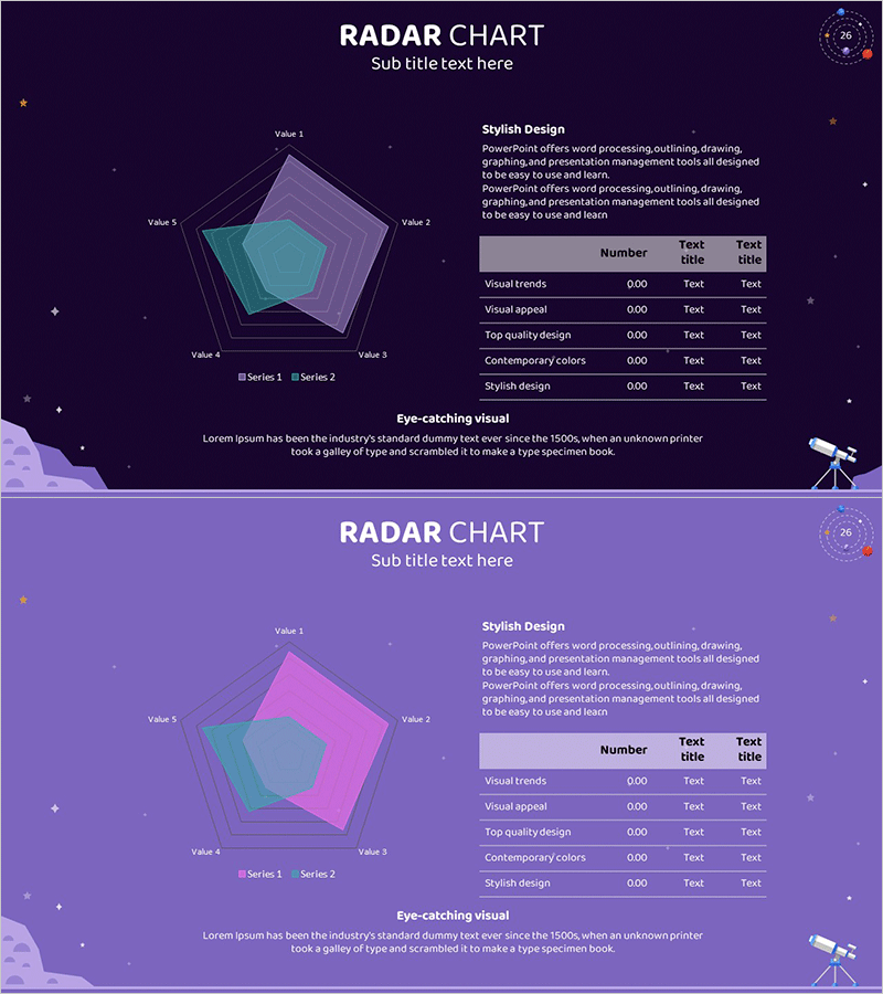
A 5-axis radar chart PowerPoint slide designed for visualizing research and development data. The dark navy background features transparent purple and teal layers in an astronomy-inspired theme, enabling simultaneous comparison of multiple data series. A data table on the right side displays numerical values for precise information delivery, while star and spacecraft illustrations enhance credibility for technical presentations. The 2-slide set offers multiple color variations (dark and light versions) to match your presentation tone. Fully editable PPTX format for immediate use.
Usage Points
-
Main Usage
Visualize and compare multiple performance indicators simultaneously in technical presentations, research reports, and development briefings. The 5-axis structure allows you to display different metrics (Visual trends, Visual appeal, Top quality design, Contemporary colors, Stylish design) side-by-side, providing a comprehensive overview at a glance.
-
How to Use
Insert this slide into technical presentations, investor pitch decks, research findings reports, or product development reviews. Input your actual data into the left radar chart and corresponding numerical values into the right table to establish quantitative credibility. Choose between dark or light version based on your presentation background color.
-
Recommended For
Technology teams, R&D departments, product managers presenting performance metrics, investor presentations demonstrating technical capabilities, academic presentations and thesis defenses, consulting firms presenting analytical findings. Ideal for any technical or analytical presentation requiring multi-variable comparison.
-
Slide Structure
2-slide set. Each slide features a 5-axis radar chart on the left (displaying two data series: Series 1 and Series 2), paired with a data table on the right containing three columns: item name, numerical value, and description. Title and subtitle areas at the top, with 'Eye-catching visual' explanatory text at the bottom for clear information hierarchy.
Related Products
-

Cylinder Shape Graph & Table Slide – Visualizing R&D Data
#Technical Approach #Diagram #Graph
-

Science Experiment Analysis Circle Graph Table Chart – Technological Advancement
#Product/Service Introduction #Technical Approach #Diagram
-

Chemical Experiment Analysis Graph Chart – Visualizing R&D Achievements
#Technical Approach #Market and Competitor Analysis #Diagram
-

Blue Pink Circle Graph & Table Chart – Slide Highlighting Visual Appeal
#Product/Service Introduction #Operational Plan #Technical Approach
