Current Status of Use of Donation Website – Key Data Analysis
RJ0800016_22
- Last Update 08/04/2025
- File Size 0.4MB
- # of Slides 2
- File Format PPTX
- Slide Ratio 16:9
- Color
Keywords
- #Content-Based Slides
- #Design-Based Slides
- #Market and Competitor Analysis
- #Marketing Plan and Strategy
- #Graph
- #Other
- #Market Status
- #Marketing Strategy
- #16:9
- #donation website PPT slide
- #usage status PowerPoint chart
- #stacked area chart slide
- #marketing analysis presentation
- #data visualization template
About the Product
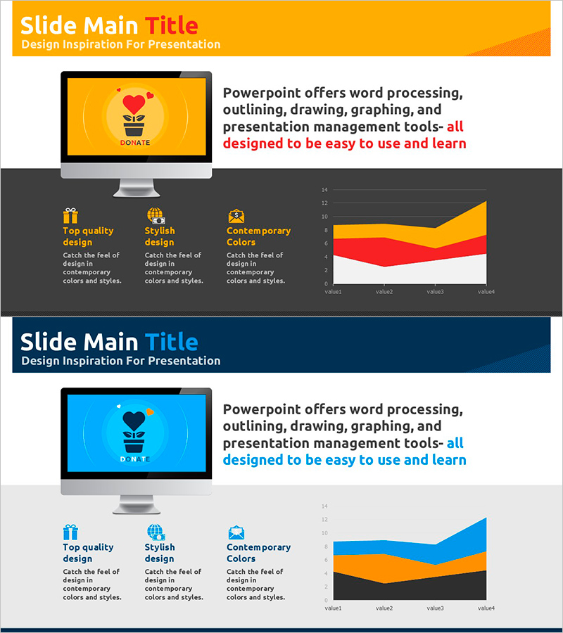
A 2-slide PowerPoint presentation visualizing donation website usage patterns and trends. Features an orange and red stacked area chart displaying time-series data, complemented by icons and descriptive text blocks optimized for marketing strategy presentations. Ideal for analyzing user behavior on donation platforms, understanding market conditions, and supporting data-driven decision-making in strategic planning phases. Delivered in 16:9 widescreen PPTX format, fully editable and ready for immediate customization with your own data and branding.
Usage Points
-
Main Usage
Analyze user engagement trends on donation platforms over time and provide data-driven insights for marketing strategy development. The stacked area chart enables quick comparison of multiple data categories and cumulative changes, effectively communicating market conditions to investors, partners, and internal decision-makers.
-
How to Use
Insert into market analysis or performance analysis sections of marketing plans, business reports, or investor pitch decks. Maintain the orange-red-white color scheme or adapt to corporate brand colors. Replace chart data with actual figures and customize content to match your presentation context.
-
Recommended For
Marketing managers, business planning teams, data analysts, and investor relations professionals presenting user behavior analysis for donation platforms or online services. Supports data-backed persuasive presentations during market assessment, performance reporting, and strategic planning phases.
-
Slide Structure
Two-slide layout: Slide 1 features an orange header with title and subtitle areas, left-side monitor mockup, and right-side text description space. Slide 2 uses dark background with three icons (quality, style, colors) and explanatory text on the left, stacked area chart on the right for focused data visualization.
Related Products
-

Consumer Trend Changes and Market Outlook – Market Trends Analysis
#Market and Competitor Analysis #Graph #Other
-

Global Market Entry & Data-Based Market Analysis Chart
#Company Introduction #Market and Competitor Analysis #Graph
-

The Importance of Modern People's Health Care – Insights from Market Analysis
#Market and Competitor Analysis #Graph #Other
-

Horizontal Bar Chart for Accident Status Visualization – Optimizing Data Comparison
#Market and Competitor Analysis #Graph #Other
