Social Contribution Spending Chart – Key to Financial Planning
RJ0800016_15
- Last Update 08/04/2025
- File Size 0.3MB
- # of Slides 2
- File Format PPTX
- Slide Ratio 16:9
- Color
Keywords
About the Product
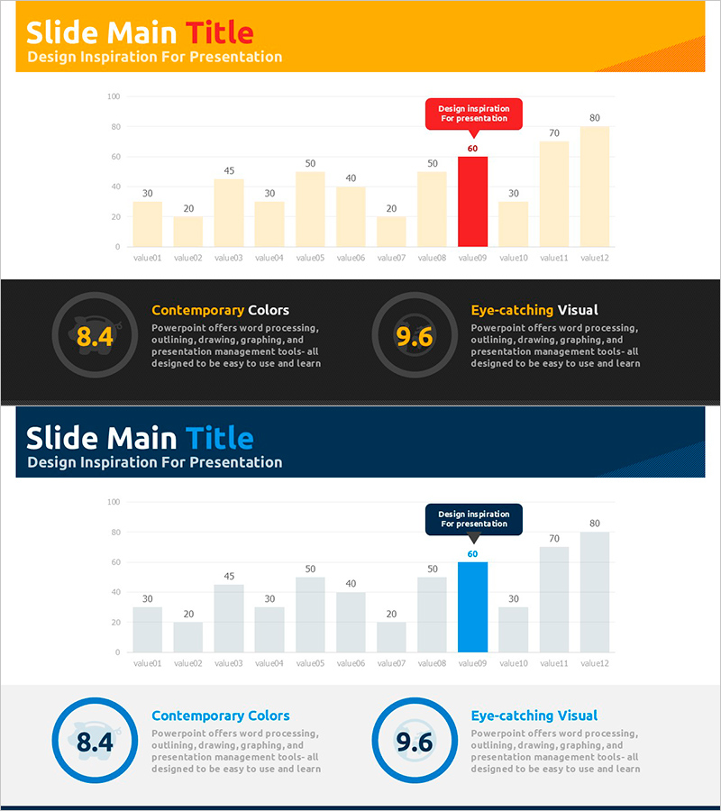
A horizontal bar chart PowerPoint slide designed for financial planning and budget analysis presentations. This template displays 12 data items side-by-side for easy comparison, with color-coded emphasis (red highlight) distinguishing key metrics from standard values (beige and gray bars). The orange header and dark background create strong visual contrast and professional impact. The 2-slide set features identical layouts for consistent data visualization across multiple comparisons. Optimized for 16:9 widescreen format, this template is ready to use for social contribution spending, departmental budgets, product revenue analysis, and other comparative financial data.
Usage Points
-
Main Usage
Present multiple data points side-by-side in financial reports, business plans, and budget analyses. The red highlight feature draws attention to key metrics, helping audiences quickly identify the most important information in your data comparison.
-
How to Use
Adjust bar lengths to match your data values and replace item labels (value01–value12) with actual category names. Apply the red highlight only to your most critical data point to create visual hierarchy. Add numerical labels above or beside bars for precise value communication.
-
Recommended For
Finance teams, marketing departments, and executives preparing quarterly or annual reports. Ideal for comparing departmental budgets, product revenue, regional performance, customer satisfaction rankings, and year-over-year financial metrics.
-
Slide Structure
2-slide set with identical layouts. Each slide features an orange header (title area), dark background, 12 horizontal bars with color coding (beige, gray, red), a red emphasis callout box, and numerical value labels. The three-color bar system visually prioritizes data importance.
Related Products
-

Negative Vertical Bar Chart – Emphasis on Financial Performance
#Financial Plans and Performance #Graph #Budget
-

Car Wide Template Vertical Bar Graph – Market Analysis and Competitive Advantage
#Market and Competitor Analysis #Financial Plans and Performance #Graph
-

Standard Table Slide Design – Effective Data Comparison
#Financial Plans and Performance #Diagram #Budget
-

Hand Shape Market Trends and Sales Revenue – Practical Graph Slide
#Market and Competitor Analysis #Financial Plans and Performance #Graph
