Green Yellow Area Chart – A Fresh Approach to Data Visualization
RJ0800015_26
- Last Update 08/04/2025
- File Size 0.8MB
- # of Slides 2
- File Format PPTX
- Slide Ratio 16:9
- Color
Keywords
About the Product
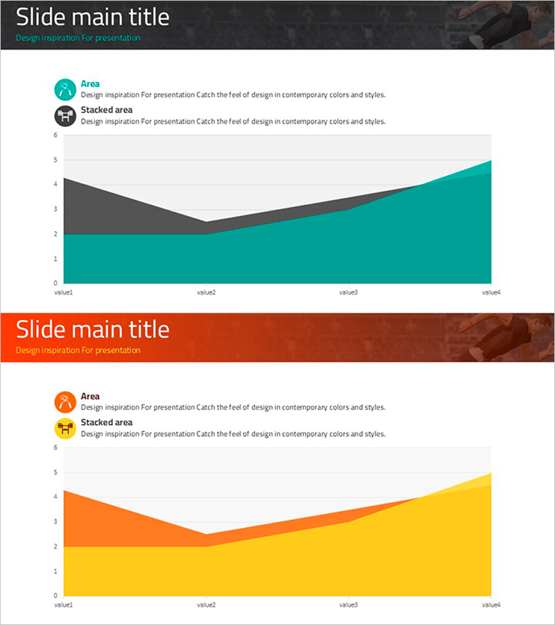
A PowerPoint slide featuring a 2-series area chart with green and yellow gradient fills that visually represent data changes over time. This 2-slide set uses stacked and comparison area chart layouts to display numerical trends intuitively. Optimized for 16:9 widescreen format, it works seamlessly in modern presentation environments. Perfect for business reports, performance analysis, sales trend presentations, and marketing dashboards where cumulative or comparative data visualization is essential.
Usage Points
-
Main Usage
Designed to visualize two or more data series over time in stacked or comparison formats. Effectively communicates sales trends, market share evolution, cost composition analysis, and other time-based comparative metrics in professional presentations.
-
How to Use
Input your actual data into the chart, and the area visualization updates automatically. Modify axis labels and legend text to match your presentation context. Adjust color schemes if needed. Insert into report sections or analysis slides for immediate use.
-
Recommended For
Financial analysts, marketing managers, business planners, and consultants preparing quarterly reports, performance reviews, market analysis presentations, and business dashboards. Ideal when multi-series trend comparison or cumulative data representation is required.
-
Slide Structure
2-slide set with stacked area chart on slide 1 and comparison area chart on slide 2. Both feature green-yellow gradient fills, legend labels, X-axis (value1 to value4), and Y-axis scale (0-6). Formatted in 16:9 aspect ratio for modern presentation standards.
Related Products
-

Main Business Analysis Graph – Performance Insights
#Company Introduction #Business Introduction #Diagram
-

Visualizing Market Analysis with Line Chart – Securing Competitive Advantage
#Market and Competitor Analysis #Marketing Plan and Strategy #Graph
-

Four Color Infographic Presentation Template Radar Graph
#Market and Competitor Analysis #Graph #Customer Analysis
-

Curve Chart of Architectural Topics
#Market and Competitor Analysis #Graph #Competitor Analysis
