Comparison Bar Graph by Work Skills – Efficiency and Performance
RJ0900014_18
- Last Update 08/20/2025
- File Size 7.1MB
- # of Slides 2
- File Format PPTX
- Slide Ratio 16:9
- Color
Keywords
About the Product
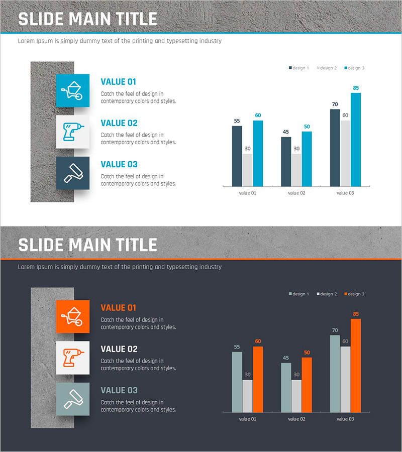
A vertical bar chart PowerPoint slide designed to compare work skills and performance metrics across three items. This presentation template visualizes three design alternatives for each of three categories (VALUE 01, 02, 03), displaying nine data points in a clear comparative layout. The slide features a concrete texture background with blue, dark gray, and light blue bar series that effectively highlight numerical differences. Left-side icons and descriptive text labels provide context, while the right-side chart ensures data clarity. Two design variations—light and dark backgrounds—are included, allowing you to match your presentation environment and document tone seamlessly.
Usage Points
-
Main Usage
Ideal for comparing performance metrics, efficiency levels, or strategic alternatives across three work categories. The three-series bar structure enables side-by-side evaluation of different design approaches or implementation options, making it perfect for decision-making presentations and performance reviews.
-
How to Use
Replace the left-side icons and text labels with your specific work categories, skills, or processes. Update the chart values with your actual data by editing the PowerPoint chart directly. Use the light background version for formal reports and proposals, and the dark background for executive briefings and strategic presentations.
-
Recommended For
Managers, project leads, and executives presenting performance analysis, efficiency comparisons, or strategic evaluations. Suitable for marketing performance reviews, operational efficiency assessments, technical capability evaluations, process improvement demonstrations, and any quantitative comparison scenario requiring clear visual hierarchy.
-
Slide Structure
Each slide combines a left panel with three icon-text pairs and a right-side vertical bar chart. The chart displays three categories (value 01, 02, 03) with three data series (design 1, 2, 3) represented by distinct colored bars. Numerical labels appear above each bar, and a legend in the upper right corner identifies the three series for quick reference.
Related Products
-

Business Idea Development Analysis Circle Graph
#Business Introduction #Market and Competitor Analysis #Diagram
-

Office Supplies Theme Competitive Analysis Bar Graph
#Market and Competitor Analysis #Graph #Competitor Analysis
-

Service Analysis Line Graph – Visualization of Competitive Advantage
#Market and Competitor Analysis #Diagram #Graph
-

Idea Development Analysis Chart – Data-Driven Innovation
#Product/Service Introduction #Business Introduction #Diagram
