Meal Amount and Momentum Graph – Market Status Analysis
RJ0800015_18
- Last Update 08/04/2025
- File Size 0.8MB
- # of Slides 2
- File Format PPTX
- Slide Ratio 16:9
- Color
Keywords
- #Content-Based Slides
- #Design-Based Slides
- #Business Introduction
- #Market and Competitor Analysis
- #Graph
- #Market Status
- #Horizontal Bar
- #Grouped Horizontal Bar
- #16:9
- #horizontal bar chart PowerPoint
- #multi-series bar graph slide
- #year-over-year comparison
- #data visualization template
- #market analysis PowerPoint slide
About the Product
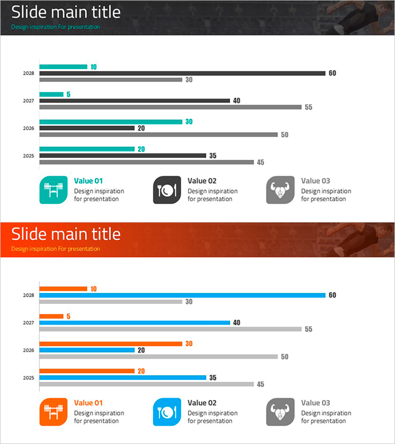
A PowerPoint slide featuring horizontal bar charts comparing four data series across years 2028 to 2025. Each year displays three parallel bars in distinct colors (teal, black, and gray) to visualize multiple metrics side by side. Ideal for market analysis presentations, business performance comparisons, and year-over-year trend reports. The 2-slide set includes a clear title section and legend area, ready for immediate use in corporate presentations and strategic planning documents.
Usage Points
-
Main Usage
Compares multiple data points across years, departments, or product lines simultaneously. The horizontal bar layout ensures readability even with longer category labels, while four distinct color series clearly differentiate each data set for audience comprehension.
-
How to Use
Edit the title area at the top to reflect your analysis topic (e.g., Market Analysis, Annual Performance Review). Customize the legend icons and labels to define each data series. Adjust bar lengths and numerical values to match your actual data, then incorporate into your presentation.
-
Recommended For
Business reports, marketing strategy presentations, financial analysis briefings, market research findings, quarterly performance reviews, and executive dashboards. Particularly effective for sales teams, planning departments, and management-level audiences.
-
Slide Structure
2-slide format. First slide displays teal, black, and gray bar series for four years of data. Second slide repeats the same structure with orange, blue, and gray series. Each slide includes three legend icons with descriptive text at the bottom for clear data interpretation.
Related Products
-

Visualizing Market Status with Horizontal Bar Chart – Emphasizing Competitive Edge
#Market and Competitor Analysis #Graph #Market Status
-

Detailed Bundled Bar Chart – Market and Competitor Analysis
#Market and Competitor Analysis #Graph #Market Status
-

Truck Logistics Equipment Status Analysis – Trust and Efficiency
#Business Introduction #Market and Competitor Analysis #Graph
-

Market and Business Trends Visualization Graph
#Business Introduction #Market and Competitor Analysis #Graph
