Weather Forecast Accuracy Probability Graph – A Tool for Market Analysis
RJ0400013_17
- Last Update 05/20/2025
- File Size 0.4MB
- # of Slides 2
- File Format PPTX
- Slide Ratio 16:9
- Color
Keywords
- #Content-Based Slides
- #Design-Based Slides
- #Business Introduction
- #Market and Competitor Analysis
- #Graph
- #Other
- #Technological Status
- #Market Status
- #16:9
- #stacked column chart PowerPoint
- #100% stacked bar chart slide
- #data comparison presentation
- #market analysis chart
- #proportion visualization slide
About the Product
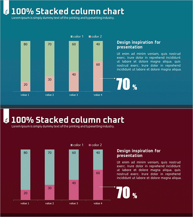
A professional stacked column chart PowerPoint slide designed for market analysis and data visualization presentations. This slide displays four data items with two color-coded categories in a 100% stacked structure, allowing viewers to instantly grasp composition ratios and proportional relationships. The design features a teal background with cream and pink accent colors, a legend, and a prominent metric highlight (70%) on the right side. Each slide includes title, descriptive text, legend, chart area, and annotation boxes for flexible customization. Ideal for market share analysis, technology status reports, competitive benchmarking, and business performance presentations. Provided as a 16:9 widescreen PPTX file with 2 slides.
Usage Points
-
Main Usage
Visualizes composition ratios and proportional relationships for market share, technology status, and competitive analysis. The 100% stacked structure enables clear comparison of how different categories contribute to the whole across multiple data points.
-
How to Use
Replace the sample data in the chart with your actual figures, and update the right-side text box with key metrics and insights. Use in market analysis, technology status, or business performance report sections where comparative data visualization is needed.
-
Recommended For
Recommended for marketing plans, business proposals, investor pitch decks, and technology status reports. Ideal for strategists, data analysts, business managers, and executives who need to present data-driven insights and support decision-making.
-
Slide Structure
Each slide features a title at the top, a 100% stacked column chart with four items on the left, descriptive text with a highlighted metric (70%) on the right, and a legend at the bottom. Two distinct colors clearly differentiate data categories, with three editable text areas for flexible customization.
Related Products
-

Hot Air Balloon Ship Illustration Mixed Graph – Market Status Visualization
#Market and Competitor Analysis #Graph #Other
-

Truck Logistics Equipment Status Analysis – Trust and Efficiency
#Business Introduction #Market and Competitor Analysis #Graph
-

Employment Gender Ratio Analysis Slide
#Market and Competitor Analysis #Graph #Other
-

Carbon Neutral Infographic Eco-Friendly Battery Chart – Modern Technology and Sustainability
#Product/Service Introduction #Business Introduction #Graph
