Office Supplies Theme Bundle Bar Graph – Market Status Analysis
RJ0300063_15
- Last Update 05/05/2025
- File Size 4.3MB
- # of Slides 2
- File Format PPTX
- Slide Ratio 16:9
- Color
Keywords
- #Content-Based Slides
- #Design-Based Slides
- #Market and Competitor Analysis
- #Graph
- #Market Status
- #Market Analysis
- #Horizontal Bar
- #Grouped Horizontal Bar
- #16:9
- #grouped bar chart PowerPoint
- #horizontal bar graph template
- #year-over-year comparison slide
- #4-series data visualization
- #market analysis presentation
- #bar chart slide template
About the Product
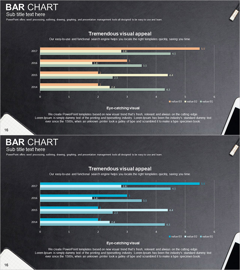
A 2-slide PowerPoint set featuring grouped bar charts with an office supplies theme. This presentation template displays year-over-year data comparison from 2017 to 2014 across four data series using horizontal bar graphs. Set against a dark gray background, the charts use four distinct colors—orange, cyan, gray, and green—to represent different data categories, making it ideal for market analysis, sales trends, performance comparisons, and business metrics. Each slide includes title, subtitle, and descriptive text areas, with clearly labeled values and a legend for immediate presentation use. The intuitive layout helps audiences quickly understand complex multi-series data during business presentations.
Usage Points
-
Main Usage
Designed to compare numerical data across four series simultaneously on a year-by-year basis. Perfect for market status analysis, sales performance reports, competitive analysis, and quarterly/annual evaluations in business presentations and strategic planning documents.
-
How to Use
Bar length and color coding instantly convey data magnitude and series differentiation. During presentations, emphasize year-over-year trends or highlight comparisons within the same year. Reference the numerical labels for precise data communication and use the legend to clarify each series' meaning to your audience.
-
Recommended For
Ideal for marketing, sales, finance, and planning departments presenting quarterly or annual performance reports, market research findings, and executive strategy meetings. Particularly effective for business plans, investor pitch decks, and proposal documents requiring credible multi-series data visualization.
-
Slide Structure
2-slide format. Each slide contains a title section, subtitle text, horizontal grouped bar chart displaying 2017-2014 data across 4 series, color-coded legend (value 03, value 02, value 01), and descriptive text area. Dark gray background with orange, cyan, gray, and green color differentiation ensures clear series identification.
Related Products
-

Real Estate Performance Status Donut Graph – Essential for Market Analysis
#Market and Competitor Analysis #Graph #Market Status
-

Paint Splash Bar Chart Template – Market Analysis and Strategy
#Market and Competitor Analysis #Marketing Plan and Strategy #Graph
-

Demand Analysis for Interior Furniture Presentation Slide
#Market and Competitor Analysis #Graph #Other
-

Product Analysis Comparison Graph – Visualizing Market Status
#Market and Competitor Analysis #Graph #Market Status
