Detailed Bundled Bar Chart – Market and Competitor Analysis
RJ0500006_7
- Last Update 06/09/2025
- File Size 0.6MB
- # of Slides 2
- File Format PPTX
- Slide Ratio 16:9
- Color
Keywords
- #Content-Based Slides
- #Design-Based Slides
- #Market and Competitor Analysis
- #Graph
- #Market Status
- #Competitor Analysis
- #Horizontal Bar
- #Grouped Horizontal Bar
- #16:9
- #grouped bar chart PowerPoint
- #horizontal bar graph template
- #market analysis slide
- #competitor comparison chart
- #data comparison PowerPoint slide
About the Product
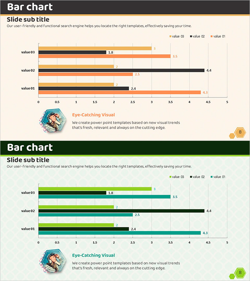
A grouped horizontal bar chart PowerPoint slide optimized for market analysis and competitor comparison. This presentation template displays three data series side-by-side, enabling intuitive comparison of values across identical categories. The design uses contrasting color schemes—orange, black, and gray in the first variant, and green, black, and teal in the second—to clearly differentiate each series. The chart features a 0–5 numerical axis with explicit labels for maximum data readability. Two slides are included with different color themes, allowing you to match your brand identity. Fully editable PPTX format for immediate customization.
Usage Points
-
Main Usage
Compares multiple data series across the same categories side-by-side. Ideal for visualizing market size, competitor performance, departmental results, or any scenario requiring simultaneous display of three or more data sets. Color-coded series enable quick identification of rankings and differences at a glance.
-
How to Use
Use in business plans, marketing proposals, or executive reports when presenting market analysis or competitive benchmarking. Particularly effective in investor pitch decks to highlight competitive advantages. Simply edit the text labels and numerical values directly in the slide to match your specific data.
-
Recommended For
Best suited for marketing, strategy, and executive-level presentations. Recommended for marketing professionals, strategic planners, and business leaders presenting quantitative comparisons. Applicable to any business presentation requiring multi-series data visualization.
-
Slide Structure
Each slide contains a title area, legend identifying three data series, horizontal axis (0–5 scale), and vertical axis with four value categories (value 03, 02, 01). Three bars are grouped for each category, facilitating direct series comparison. Both slides share identical structure with different color themes.
Related Products
-

Market Status and Competitor Analysis – Emphasized with Green and Navy
#Market and Competitor Analysis #Graph #Market Status
-

Office Supplies Theme Bundle Bar Graph – Market Status Analysis
#Market and Competitor Analysis #Graph #Market Status
-

Future Outlook Analysis Graph – Market and Competitive Analysis
#Market and Competitor Analysis #Graph #Other
-

Medical Record Analysis Bar Graph – Market and Competitor Analysis
#Market and Competitor Analysis #Graph #Competitor Analysis
