Brown Green Donut Chart – Visual Data Representation
RJ0800014_15
- Last Update 08/03/2025
- File Size 5.5MB
- # of Slides 2
- File Format PPTX
- Slide Ratio 16:9
- Color
Keywords
About the Product
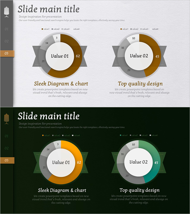
A professional PowerPoint slide featuring two donut charts side-by-side in brown and green color schemes. Each chart displays a central circular area with key metrics and a surrounding donut ring divided into four data series with distinct colors. Gray ribbon banner accents enhance visual hierarchy, while legends and detailed value labels provide clear data reference. This slide design is ideal for business presentations comparing two key performance indicators or metrics simultaneously. The 16:9 widescreen format includes 2 fully editable slides ready for immediate use.
Usage Points
-
Main Usage
Visualize and compare two key metrics or category compositions simultaneously. The central circular area highlights primary values while the four-color donut ring clearly differentiates data layers, enabling instant comprehension of comparative data relationships.
-
How to Use
Apply to financial reports comparing revenue streams, marketing dashboards analyzing channel performance, business status reports showing departmental contributions, or quarterly performance comparisons. Simply replace 'Value 01' and 'Value 02' labels and update numerical values with your actual data.
-
Recommended For
Finance teams presenting quarterly or annual results, marketing departments analyzing channel ROI, executive briefings, departmental performance comparisons, investor presentations, and business unit performance reviews.
-
Slide Structure
Two-slide set with dual donut charts per slide. Each chart comprises: central circular area (Value 01/02 label), donut ring (four-series color-coded segments), ribbon banner decoration, legend (value1-4), and detailed numerical labels. Light and dark background versions included for flexible presentation contexts.
Related Products
-

Ranking of Popularity Vote on the Menu – Visualized with Horizontal Bar Chart
#Market and Competitor Analysis #Financial Plans and Performance #Graph
-

Gender Ratio Customer Analysis Pie Chart – Emphasizing Customer Insights
#Market and Competitor Analysis #Graph #Other
-

Business Forest Wide Template Line Chart – Highlighting Financial Performance
#Financial Plans and Performance #Graph #Sales and Revenue
-

User Analysis Graph by Age Group – Advanced Data Insights
#Market and Competitor Analysis #Diagram #Graph
