Construction Status Graph – Market Analysis and Competitive Statistics
RJ0800012_13
- Last Update 08/03/2025
- File Size 0.3MB
- # of Slides 2
- File Format PPTX
- Slide Ratio 16:9
- Color
Keywords
- #Content-Based Slides
- #Design-Based Slides
- #Market and Competitor Analysis
- #Graph
- #Market Status
- #Horizontal Bar
- #Segmented Horizontal Bar
- #16:9
- #horizontal bar chart PowerPoint
- #construction market analysis slide
- #competitive statistics template
- #year-over-year comparison chart
- #how to create bar chart in PowerPoint
About the Product
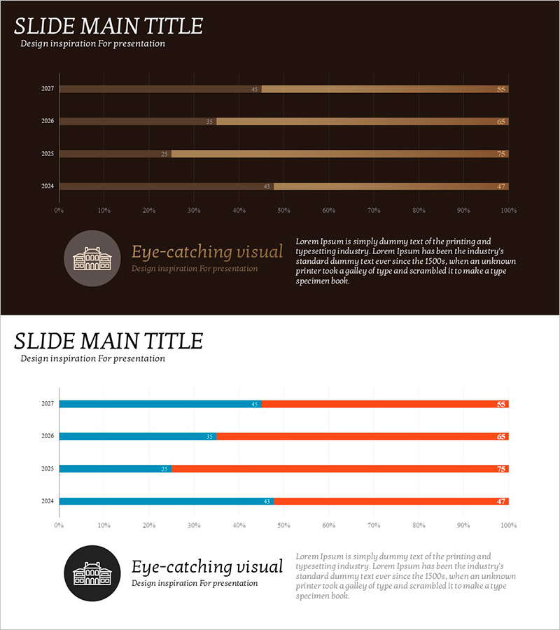
A horizontal bar chart PowerPoint slide designed for construction market analysis and competitive statistics visualization. The slide displays data across four years (2027 to 2024) using two data series in warm brown and beige tones, with clear numerical labels on each bar. Set against a dark brown background, the contrasting color palette ensures excellent visibility for presentations. This slide template is optimized for construction, real estate, and market research sectors to compare annual performance and competitive positioning.
Usage Points
-
Main Usage
Used in construction, real estate, and market research sectors to compare year-over-year statistical data. The dual-series bar format allows simultaneous comparison of competitive performance, while numerical labels ensure precise information delivery. Ideal for market analysis presentations, business performance reports, and investment proposals.
-
How to Use
Open the slide and replace the bar lengths and numerical values with your own data. The brown and beige color scheme can be customized to match your corporate branding, and the legend and axis labels are fully editable. The dark brown background can be retained or modified as needed for your presentation.
-
Recommended For
Recommended for executives, marketing teams, and sales departments at construction companies and real estate developers presenting market analysis. Also suitable for financial institutions' industry reports, consulting firms' strategic proposals, and government agencies' policy presentations.
-
Slide Structure
Two-slide layout featuring horizontal bar charts with four years (2027, 2026, 2025, 2024) on the Y-axis and 0–100% range on the X-axis. Two data series bars are positioned side-by-side for each year, with numerical labels displayed at the bar ends. Dark brown background and gridlines enhance data readability.
Related Products
-

Global Market Entry & Data-Based Market Analysis Chart
#Company Introduction #Market and Competitor Analysis #Graph
-

Bar Chart for Market Analysis Visualization – Innovation and Growth
#Business Strategy #Market and Competitor Analysis #Graph
-

Market and Business Trends Visualization Graph
#Business Introduction #Market and Competitor Analysis #Graph
-

Bar Graph Visualization of Pet Data
#Market and Competitor Analysis #Financial Plans and Performance #Graph
